Colourblind Gaming: Is It In His Eyes?
Friend of RPS and sometime games journo Dan Griliopoulos suffers from deuteranopia, a form of red-green colourblindness. He's a lifelong gamer, yet the industry at large seems entirely ignorant of how difficult games that rely on red and green differentiation can be for his condition - one that's shared by at least 6% of all males. So, pray allow the man to vent a little...
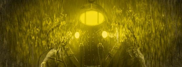
I'm Big Daddy Delta, terror of Rapture, splitter of splicers, defender of the weak, diving suit fetishist extraordinaire. I'm stuck on one side of a door, there's a broken window and a yellow glowing switch a few feet away. I have a clever hacking dart gun, which requires my simply pressing a button when a needle on its meter passes through a certain colour. I shoot, I score... and get a mild electric shock. I repeat. Again and again. There's an endless supply of darts so I keep shooting until I die of Electron Overdose and respawn, humiliated, at a Vitachamber. Yet again, someone on the art team has thoughtlessly swallowed the Manichean standard that red is bad and green is good, and decided he should use a primary palette to distinguish between these opposites -which means poor old colour-blind me gets killed.
For me, that hacking tool is the most lethal monstrosity in Bioshock 2. In the hacking minigame, red hurts you and wastes a rare and pricey hacking dart, green is success. Negativegamer have already broken this particular howler to the world, complete with [frankly startling to us non-colourblind types - RPS Hivemind] Photoshopped images demonstrating roughly what the hacking dial looks like to various different types of colourblindness. In my case, both red and green appear as a murky yellow. Or so I'm told - it's not as though I've ever seen what green, red or yellow looks like to everyone else. Eventually, through trial and error, I worked out there are just-detectable contrast and location differences in the puzzle, and that if I focus really hard and fast, I can just work out which is which before the timer runs out. Bioshock 2 just got challenging.
Bioshock 2's oversight has since been picked up by Kotaku, and hopefully that'll be loud enough a protestation to entice a much-needed patch out of 2K - but what about the rest of the industry? It hasn't paid much attention to it in the past. This screw-up is everywhere in games. My first experience was an old halflife mod called, I think, Frontline Force which, curiously, played and looked just like Modern Warfare 2 (multiplayer War FPSes don't really change much do they?)

For some reason this, and MW2, differentiate enemies by red & green names (I'm told, never having been able to tell the difference) meaning all colour-blind gamers spend their time following other players trying to work out what team they're on, then spraying bullets into them randomly anyway. Puzzle-Bobble is unplayable. I could only play Rockstar Table Tennis on the consoles by watching my opponents' arm movement (praise be to the redundant beauty created by anal designers). Battleforge has problems. Darwinia and Quake just look like rubbish sepia nonsense; I imagine Space Giraffe looks even more of a mess for me than for you.
Now, I know, there's a lot of whingeing constituencies in the endless depths of PC Gaming, endlessly grinding their particular axes about DRM, patching, netcode, whatever happened to The Monster That Ate Kieron's Beard and so on. Clearly, they have good cause - but colour-blindness is a genuine disability. Yet it doesn't enjoy anywhere near that degree of outraged campaigning. Without deliving through too many Wikipedia pages, I can't think of a Western nation that doesn't have disability legislation. This can be easily dealt with if the developer just thinks about it as part of a design doc, and is easily reparable afterwards. So why don't they do it?
You see, designers, there are certain colours of Red and Green that aren't problems. Traffic lights, for example, have carefully been designed (blue-green, not green!) so that there's no problems, but pure colours are a no-no. You've also got to remember there are three strains of colour-blindness, two common (red-Green, 8% of males, one really rare (yellow-blue, 0.01% of people) to take account of. Here's some tips for developers, and cross-stitchers.
So are there any developers worthy of praise? Valve, as always. The two TF2 teams are cleverly designed as no-one, except very rare monochromatics, have difficulties telling between red and blue, and Left4Dead has a range of colour-blind modes. Popcap are also heroes, with Peggle's superb colour-blind mode being a thing of beauty, but most puzzle games are blasted nightmares.

The question is, if a little team like the Galcon developers can get it right, off the bat, first time [Galcon Fusion has an optional colourblind mode, supporting up to four players), how can a firm the size of Activision or EA consistently ignore what could be 8-12% of their paying customers? That could be a million of the people who bought MW2, for example.
There are upsides to this, of course; Colour-blind people typically have better pattern recognition, so can see through camouflage or spot objects more easily in complex scenes. We can also differentiate shades of khaki better, which means we'd make excellent military couturiers. Hidden object games, or games that use obfuscate through colour rather than pattern, we own.
The harder levels of hacking in Bioshock 2 add a bonus blue colour, which perversely makes it much easier for the colour-blind. Unless they're yellow-blue, in which case it suddenly becomes even harder.