User Interfarce: Skyrim's Silly Choices
Frustration Is On The Menu
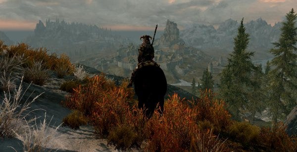

Oh, Skyrim. I really am so enamoured by your peaks, and your misty valleys. Oh, what a beautiful world, filled with possibility and with cheese. Oh, Skyrim, let us bask in the the spook of your ghosts and squirm in the horror of your catacombs. Let us be gleefully smacked about by giants and devoured by dragons. Let us steal hats and trade them for unexpected potions. Oh, Skyrim. There's so much to you that there are even ants crawling on this log! Blimey.
And then we bring up the menu. Oh, Skyrim.
UPDATE: Someone went to the trouble illustrating what I am talking about, here.
I'm embarrassed, basically. Embarrassed that I have to sit here writing about fucking interfaces and menus when I should be talking about the fascinating bigger picture of a broad, detailed, open-world RPG. Man, when there's so much going on in this game, and so much to talk about, why did I have to be the one who put up his hand and said: "But what about that crappy interface?"
I know I signed up to be a dork for a living, but for fuck's sake.
My plight is so: this is the first Bethesda game I've ever actually been able to spend serious time in without becoming fatally annoyed. Skyrim has done what their other games have not: it has managed to not eject me from its world through sheer frustration (as did Oblivion and Fallout 3) and I have begun to get lost in side-quests and exploration as I plod slowly through my career in professional dragon shouting. I like the world. I am enjoying the story. That's quite the thing.
Then I hit tab, and I sigh. I rumble. Even when played with gamepad, as it is surely meant to be, the back end UI of Skyrim is a horrible clonky mess. Thoughtless, awkward, unhelpful. I don't think it even tells you to hit tab to exit when you first encounter it. (In fact Kieron tells me he got stuck searching for the exit key the first time he tried to pick something up.) Sure, Fallout 3's wrist-thing was crap, too, but I don't care about that right now. I care about Skyrim. And it's not good enough.
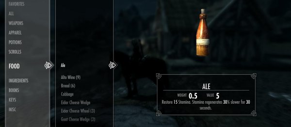
Skyrim's menu, a huge, unwieldy thing that wants you to scroll from a menu on the left, and then takes over the rest of the screen with sparse "details", is as cumbersome as any I can imagine, and that's without the general issues of navigating it with a keyboard and mouse.
Hell, Oblivion's awkward interface was bad enough, but at least it allowed you to see almost everything at a glance. And sure, Bethesda, take away my stats, but at least allow me to see what I am wearing and equipped with inside the menus? The bonuses I have? Anything? No? And so I have to exit the menu system to look at my character? And I also have scroll through everything just to see what I am carrying? And even when you are clicking about in the menu there's a huge margin of error with a mouse, that most precise of pointing devices? Come on, Bethesda, this is not the future of RPG interface design we were promised.
And you want to use essentially the same menu for trading? Okay. No. This is not okay. It's time consuming and opaque. I am a bold fantasy adventurer, not a guy browsing ostentatious Flash-driven websites circa 1999.
Ah, but then there are also the twin horrors of the perk screen and the map. Selecting what bonuses you are going to get is, for some reason, built into a carousel of star constellations... no, stop right there. You can see the problem right away: "a carousel of star constellations". That is one of those ideas that surely a design team would react to with "yeah, nice idea Dave, but really we just need something that allows the player to see what they are choosing, and what result that will have in the game..." Instead it seems to have made it through to release, delivering a +40% increase to bafflement for anyone who tries to use it. I mean it: a carousel of star constellations. A what. Why.
The issue with that, and much else here is a lack of summary: I want to find what the fuck is going on with my dude! Why are people saying I look like I have the plague? Look under magic -> active affects. Oh, of course. Lucky you bothered to put it in there. I MIGHT NEVER HAVE FOUND IT WITHOUT GOOGLING THE RESULT.... OH.
Then there's the map. A lovely 3D map. Swish! ZooM! And I can't see anything because of clouds, and I can't zoom out far enough to take it all in, or give myself a proper sense of place. Why bother with this at all? Give me a static 2D map, thanks.
There are other crimes, too: you can't get at the settings - the basic settings of the game - from the main menu. These come when you are inside the game itself. Huh? I can't get at the parameters for play until I am playing? It's this sort of illogicality of nesting that makes me want to cry. It doesn't take an exhaustive study of PC interfaces to see how this stuff can be done sensibly.

Amazingly, if you have a gamepad plugged in the some of keyboard and mouse short cuts fail to work at all. Why? Why not just leave the original binds active, too? Worse, once the gamepad is deactivated, you are faced with keybinds that may or may not rebind, depending on what it is you've decided to rebind. The failures seem arbitrary, but they also seem totally unacceptable in one of the biggest PC releases of the year.
It's funny. I step back and look at this, with Bethesda clearly trying to do something new and slick with their interface, and then I look at the Diablo III beta. And I realise that RPG back-ends work in a certain way for a good reason: we need information. And we need it immediately. And we don't want faff about scrolling, or getting full-screen renders of the apple in question. We just want the goddamn thing to work - to compare hammer stats, to show us what armour we have, or could have. Diablo III does little that is new with its menus and interface, but it is always RIGHT THERE, and you know what you need. Hit the key and read off the info. Simple! And as a result the experience is silky. The difference here seems to be that Blizzard actually pay attention to the fact that their games are going to come out on the PC. Sure, Bethesda have their hapless console chums to think about, but that should not be at the expense of their fiercest, most loyal, and most creative fanbase. We needed a PC interface. We did not get one.
In conclusion, here are some helpful (and fun!) rules of RPG interface design:
- When designing a UI, try to design not only for the platform your game is on, but also for the type of game you are making!
- If it is broken, fix it!
- If it ain't broke, please do not invent totally new forms of interface, like those based in stars. Instead: get something that works and polish the fuck out of it.
That's better. Right, back to thieving more ale.