An Hour With: Shadowgate
Save Thyself
Shadowgate is back. The 1987 RPG adventure, probably the most fondly remembered MacVenture and a distinct entry into the NES's catalogue, has been remade and expanded. It's out now, and I've played it for an hour or so. I grumble.
I didn’t play Shadowgate when it first came out. This was partly due to my being 9, and partly due to its primarily being known for being a NES and Apple Macintosh game. We were not a Mac family. In the mid 80s, my dad’s computer set-up on the spare bit of kitchen counter (behind the door, so you had to remember not to open it too hard) would have been an Atari 520. We’d likely have been playing Dungeon Master. So it is without specific nostalgia that I approach this remake.
But not without nostalgia altogether, of course. Being 9 or 10, and playing RPGs with my dad, is a pretty fundamental happy place for me. He’d get home from work at about 5.30, we’d have dinner, and then at 6pm he’d plonk himself down by the breakfast bar and I’d climb up onto the stool next to him. And help. You can imagine.
So I don’t experience that peculiarly wistful temporal magic when looking at a screenshot of the original Shadowgate, in the same way as I might when seeing a game I’d frequently played then entirely forgotten about (like, say, D/Generation or Nebulous), but it’s evocative of a special era for me.
Shadowgate 2014 will, I suspect, never be such an experience for any current nine-year-olds. I can’t imagine in 30 years anyone will mention the game’s name as a magical incantation. I suspect this because they’ve created something that doesn’t feel like it belongs in any time.
The core concept of the game remains the same, and while that initially sounds like the right decision, it’s too much the same. This new version takes advantage of resolutions a squillionty-times bigger than the original, with entirely re-drawn graphics, new locations and puzzles, but it takes advantage of very little else.
The game – a first-person fantasy adventure-RPG – takes place in static screens, with movement conveyed via transitions. I would have loved to have seen an embracing of something more Legends Of Grimrocky, but understand the game sticking with this format. What I don’t understand is keeping the verb-based interface. What I absolutely don’t understand is keeping the verbs at the top of the screen, in the most clumsy arrangement.
Originally the viewing area of the screen was a small box, in the middle, and obviously that would be daft now. Instead, rightly, the whole screen is the viewing area. Unfortunately it’s one that is then obscured and cluttered by having the original enormous text box covering the bottom fifth of the screen, and the verbs blocking the top fifth. With so much more space, with widescreen now the norm, there was such an opportunity to move the verbs and make the layout more sensible. Heck, the NES version in 1989 moved them to the right! You can hide the UI entirely, but then of course you're just stabbing at keyboard shortcuts, and it's even more confusing. There was such an opportunity to streamline this, but instead it's just as it was.
There were excellent systems invented by the 1990s, such as rotating cursors, or right-click in-frame menus, that dealt with the frustrations of late 80s adventuring. It's odd that this is all forgotten. And that this wasn't seen as a chance to try improving things, making it all slightly more intuitive, and having the game realise if I click my lit torch, and then on an unlit torch, I’m probably not trying to get the first to eat the second. That if I want to USE a lever, there's a fair chance it's not going to be an unavailable attempt to chop it to pieces with a sword, but just, well, use it.
And in another backward step from the earlier version, your inventory is now a pop-up window, meaning to use something in it, you’re now clicking to open up the needlessly screen-filling box, highlighting an object in there (but not visibly picking it up) then the choosing a verb from the top, and having to re-close the inventory window to be able to actually use the object. If I select "USE" after I've clicked on the key, it could just flipping close the inventory for me. It’s just so clumsy. Again, the 90s figured this out, with inventories that slide into view when the mouse hits the edge of the screen.
The result means an extremely archaic system remains laborious to play. Which is an odd choice. I’m absolutely certain that many will be thrilled the verbs are still in there – I get that. A remake of Day Of The Tentacle with the verbs removed would be a difficult thing for me to be happy with. But here they’re more of an obstacle than they ever were twenty-five years ago.
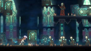
The other massive issue I’ve experienced in the early parts of the game is the choice of how the game’s been redrawn. Originally it was scratchy collection of line drawings for the Mac, then made pixelly for later releases. And it looked smart and pleasant. Now it appears to be a collection of concept art. Nice enough, but, you know, what you’d usually see pinned to noticeboards in development studios, or printed in ludicrously shiny art books accompanying £200 special editions. That’s fine – that’s a stylistic choice, albeit one that makes the game look scrappy. But unfortunately, interactive objects are too often rendered in the same way. So I was left aimlessly clicking at the screen, trying to work out what might be a rock I'm supposed to care about, and what’s just background detail. Even worse, when I have clicked on something I can use, it’s indicated by lightening up slightly – something that’s almost imperceptible in many cases.
And oftentimes, these hand-scribbled scenes just look dreadful. Barren, bland and frustrating to click around.
This, combined with the insta-death for clicking on the wrong thing, for me made for a wholly unappealing process – one that’s a real struggle to want to stick with in the space year 2014. Oh, and they've added a smug skull who gives you smug hints - he's a dick.
The whole thing, weirdly, feels to me like a backward step from the far more optimised NES version. There is, however, quicksave, and they’ve set up a way to assign some actions to number keys, but none of it fixes the core stumbling points here.
If you have particular nostalgia for the game, I can understand wanting to experience it anew. It’s not an identical game – the original team has added new areas and puzzles, meaning it’ll be a new experience even for dedicated fans. But I no longer possess a tolerance for games that enjoy killing me every other screen because I clicked on the wrong thing, and I suspect I’m not alone. I equally suspect that there are many who desperately yearn for this, and will claw at this to enjoy the punishment.
I so wish more effort had been put into updating the game (with options to retro it for the mad). I am certain this will find an audience of those who yearn for the olden days, but equally sure it will not grab a new audience who can only read about such days in dusty old books.
Shadowgate is out now on Steam for a launch price of £13.49 (and £15 after one week).


