Four Examples Of Excellent Interface Design
Let's Interface

Welcome class. Take your seats and take out your note paper.
We've all struggled through a game with a bad interface, one where none of the icons are clear, the screen is cluttered, and elements are unresponsive. Those problems still rear their heads in every genre, but I think we've more examples than ever of how to do an interface well. Let's look at a few of them.
We'll have a discussion at the end of class if you have anything to say.
Now, we take them for granted every day, so it's worth stressing just how difficult interfaces are to make.
For example, I'm sure you all think that buttons - the smallest unit of interface currency - are easy to make. You just click them and they do a thing. Although probably you'll want to animate them a little, so there's a feeling of travel when you click them, would you? And how are you going to tell whether a button is already pressed? You'll have to change their visual state so you can tell whether they've been pressed recently. Is it too annoying if they make a click noise? And what if you click down on them, change your mind, and only release the left mouse button when you've moved the cursor off the on-screen button? Can we get a show of hands for who thinks that shouldn't count?
Should the buttons be themed as per the style of the game? Who here can spell diegetic or skeuomorphism?
Games that present users with all the information they need, in intuitive ways, and which are fun to use, ought to be applauded, but we rarely take the time to celebrate parts of games we expect to 'just work' and so only talk about when they don't. Now, turn to your textbooks and we'll look at some case studies.

Papers, Please
A masterclass in conveying information to the player, Papers Please splits the screen into sections: the top shows the queue in front and the police state behind your booth; the bottom left shows the inside of the booth itself, including the face of the person at your window; and the bottom right shows a zoomed view of the documents you're checking.
This is the whole game in a single screen, and it contains everything you need to play. Conversely however, it gives you very little information about how it works. Instead the game gives you an infinite stretch of time before your booth opens on each day, enabling you to experiment. By giving you multiple views on the same situation, it allows the interface to be direct and intuitive - for example, it makes perfect sense that in order to call the next person in line, you click the megaphones on the roof of your booth.
It also does a good job of conveying the game's themes and snapping you into the mindset required of the player. The booth feels claustrophobic, stuffed as it is into the bottom left, while the zoomed-in view encourages attention to detail. The screen along the top is a constant reminder of the context in which you're working, and the small pixel art people, faceless and shuffling, are perfect for the setting.
Questions for the class: It's easy, as the number of documents mount, to feel like you don't have enough space to work. Is this a fair extension of the game's central challenge, or does it feel artificially enforced by the interface? Should the documents you work with have had physics in them, causing them to sway or rotate a little as you move them, or would making them feel less like windows pop-ups have simply obscured the challenge further?

Democracy 3
It might seem unusual to celebrate an interface that's such a muddle of icons, but Democracy 3 is a game entirely about its interface. It's about its interface in the same way as Call of Duty is about clicking on men, no matter what storyline or theme is placed upon it.
In this case, the theme is politics, and the interface is designed to enable your attempts to lead a country and to chart the impact your decisions have on different parts of the electorate. It does both these things through the same spiderweb of information.
It can be initially overwhelming, which is obviously not a good thing, but most games might be tempted to put a simpler interface on top and hide the information in the spiderweb away in a submenu. Those game would patronise the player while at the same time obscuring the information that's vital to them playing.
Democracy 3 is great because it combines its information and its control interface into a single interactive screen of data, and in doing so, it makes it both straightforward and fun to read and play.
Question for the class: Can you think of filtering methods that could be used to convey the same information without simply splitting it across multiple screens?
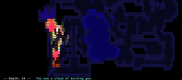
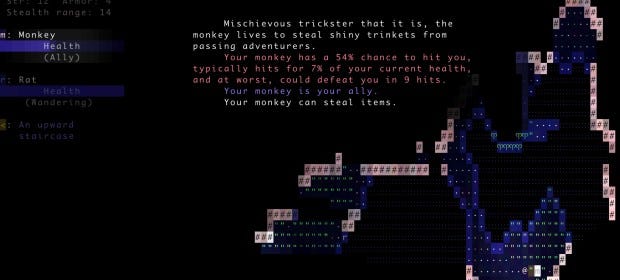
Brogue
There are plenty of roguelikes with pretty graphics, whether they're grid-square tiles or more elaborate. Brogue doesn't have that, instead using old-fashioned ASCII - albeit with a set of effects that make the world colourful and alive.
What's remarkable about its interface however is it takes those ASCII graphics and makes them perfectly clear. This is largely because of its implementation of mouse controls, where you click to move and attack and mouse over any character on screen to find out what it is. That might be as simple as "You see dense foliage," or as detailed as a write-up on an attacking Jackal, which includes flavour text and combat stats.
The result is a roguelike that is as broad, flexible and free as the best of its older genre-mates, but which can be picked up and played by anyone, instantly, without any kind of tutorial.
Question for the class: Brogue also supports keyboard controls, but is anything lost if you choose to control the game via the mouse instead of a more traditional set-up?

Elite Dangerous
Frontier's latest space sim has problems, but its interface isn't one of them. No matter how quickly you grow tired of travelling, trading, mining or fighting, it's hard to grow tired of the menus which are built into your ship's cockpit. Turn right to check your modules, turn left to check your map, look down to check your radar. Becoming a good space pilot is as much about fast navigation of these in-world menus as it is learning to steer and dock in three-dimensional space.
By setting the menus entirely within the world, Elite's interface is one of the many ways in which it sells its space captain fantasy. The peak of this is the overlays that appear on nearby ships, telling you, for example, what direction they're travelling. Those aren't magical game overlays, but information that's being projected onto the windows of your ship - which means if those windows get smashed during a fight, the overlays disappear, too.
Except, they don't even disappear entirely. They only disappear on the parts of the smashed glass that are missing, coercing you into angling your ship in certain ways in order to receive vital information on the enemy about to kill you.
Performing actions within this interface feels flavourful like any other pilot manouver; you can frantically click the button to go launch your hyperdrive, or coolly radio a station to ask for docking permission. Nothing is ever just a button.
Question for the class: Elite explains very little to its players, all but requiring that they turn to external sources - ie. Reddit - to learn how to play the game. Should your cockpit therefore include a browser window through which you can visit real world webpages, or does that break the fourth wall more than alt-tabbing to a Chrome tab?
OK class, let's discuss.
This article was originally published for the RPS Supporter Program. Thanks for supporting the site!