Dote Night: The Colour Palette Of Heroes
Red, the blood of angry... Dotamen?

Artist Arthur Buxton has just released a beta version of his Colourstory app. Buxton's work tends to focus on breaking down complex images into their constituent colours and creating pie charts or colour strips from the results. With the app you can generate these stylised palettes yourself by uploading pictures for the software to analyse. Obviously my go-to test material was Dota 2 screenshots.
One of the things I found fascinating about Buxton's earlier projects were how recognisable certain images could be even when abstracted into colour bands. Van Gogh's Starry Starry Night and his Sunflowers were the ones which stuck in my mind. With that in mind, for Dota I picked headshots for heroes I think look similar in terms of their colouring and ran them through to see how accurate I was.

The results reminded me of Valve's own Dota 2 Workshop guides for user-created items. I assume a lot of players aren't familiar with those because they're PDFs linked to from the main item creation info page. One of these is an art guide [PDF] which goes into detail on the colour palettes of the heroes. It also offers up a heck of a lot of visual design information beyond colour (which is good if you're reading this and have some form of colour vision deficiency) which I find absolutely fascinating and wanted to share here.
The reason Valve are providing this information is because they want the Workshop items to "remain artistically consistent with the original design" so they go into detail on how they design the heroes in terms of colour, texture and so on.
The first point is to do with basic orientation – a character's silhouette needs to tell you who they are, what direction they're facing and also offer clues about speed of travel etc. But once that essential legibility is sorted there's a whole world of value, colour and texture to contend with.
'Value' means the range of lightness and darkness. You can see value in an image most easily by opening it up in something like Photoshop and switching to greyscale. According to Valve:
"One can argue that value is more important than colour to design and the success of a character because not only is it used to create focal points, it creates the illusion of depth and also helps give three-dimensionality to the object."
You can see how this works when you look at pretty much any hero in the game because they'll generally have really dark feet or lower bodies and then gradually get lighter until you reach the top of their head. The purpose is to guide your eye to the character's head and upper body. You'll also see the general dark-to-light gradient augmented by value contrast. Value contrast means the difference in the lightness of two things. Low value contrast is what you'll find at the bottom of the character, where everything is generally darker. High value contrast will happen towards the top where you might have patches of darkness but they butt up against far lighter areas and draw the player's attention.
"Before adding colour, test your value patterns in-game. Be sure the character's features are recognisable and that the most important features draw the eye" – the point here is that you shouldn't be relying on colour to convey all the information about a character. Their colour palettes will be distinctive and I think it's easy to assume that's the strongest factor in being able to pick a character out onscreen but it's underpinned by all this value and silhouette work.
It's only then that colour comes into play.
The basic advice is as follows:
1. Work out a colour palette using general colour theory principles then don't stray far from it
2. Don't use colours which are prominent in the map scenery
3. Avoid pure saturation (MAXIMUM red, green, or blue)
4. Constantly be using greyscale to check you've not buggered up the values
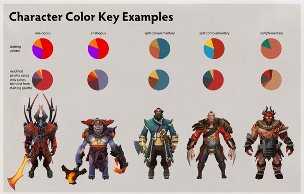
The colour schemes, as I said, relate to colour theory concepts: complementary colours; split complementary colours; analogous colours and triad colours. Complementary just means the colours are opposite one another on a colour wheel. Split complementary means you take a complementary colour pair and then for one of the colours you ignore that and pick the two either side of it. Analogous means colours that are next to one another on the wheel. Triad means three colours equidistant from one another on the wheel – red, green and blue, for example.
So you get an idea for how these relate to the heroes, Kunkka has an ocean blue as his main colour and then the other two are orange and yellow chosen through the split complementary process. These other two colours are then modified using blending techniques so as not to lose the colour harmony – they end up a chestnut brown and a sandy yellow. Lion gets the analogous treatment and starts off as mainly red with orange and purple additions. The blending and refining for him takes his palette to a dusty mauve main colour with a lot of aubergine thrown in. The red becomes more of an accent colour with dashes of orange and yellow thrown in as highlights.
Returning to Buxton's app, the images I've been generating use the headshots on the official website character pages rather than Valve's actual documentation. But those are the images you see if you use the grid view during hero selection so it makes sense to assume players are familiar with them. The colours are slightly distorted as it's a cropped view so don't be surprised if it feels incredibly difficult. With that in mind I've run a handful through ColourStory – let's see if they're recognisable now they've been abstracted...

I'll pop the answers in tomorrow!
Answers:
1 Lion
2 Shadow Shaman
3 Kunkka
4 Huskar
5 Medusa
6 Shadow Fiend
7 Io
8 Rubick