Videogame subtitles could learn a lot from comic book lettering
The shape of sounds.


Being a comics letterer is not a real job. Or at least, that’s what most people believe. After all, letterers only have to make balloons and fill them with the words written by someone else. It sounds so simple - a job a computer should be able to do automatically. I mean, they basically do already, 'cos these days letterers don’t even have to write the text by hand anymore! They only need to know how to draw circles and copy-paste words in Photoshop.
This notion is, of course, wrong. You never notice when a letterer has done a good job, because their goal is to remain unseen. They work hard so your eyes can fly effortlessly over the page, always knowing who said what and where to look next. Explore a lettering site like Blambot and shudder in fear at the number of rules needed to make a single balloon look good, from the distance between text and balloons borders to the shape of the balloons themselves. Lettering is a difficult job that mixes composition, typography and design, but we only notice it when it's done badly. It's truly a pity we don't take it more seriously, because videogames would benefit from a deeper understanding of this invisible art.

We've all stumbled upon games where the text was... off. Games where the font was too small, too ornate, or just felt disharmonious in a way that was difficult to place. In the worst cases, bad text can make a game almost impossible to play. And big titles aren't immune from this: The Outer Worlds was recently patched to fix the game’s minuscule font size. Death Stranding also suffered from similar issues — though it should be all fixed up for its arrival on PC.

Voiced games with subtitles you can toggle on or off are some of the worst offenders, because subtitles fill the screen with text that isn't thought of as being a full part of the game experience. Their design ends up feeling very much like an afterthought. This article written by Max Deryagin in 2017 is still a painfully relevant catalogue of all the crimes regularly perpetrated against my poor myopic eyes: small font, poor contrast, incredibly long lines.
There is no direct equivalent to comic letterers in games development. Instead, you have UI artists, UX artists, and a myriad of technical questions to answer. Is this interface readable in all the screen resolutions that our game supports? Does our text engine support text from right to left, for Arabic localisation? Will this menu look terrible once it's translated into a language with longer words, like German? Developers spend so much time making sure text is readable at all, they then can't make sure it looks good. Every solution more complex than a message window at the bottom of the screen requires so much additional work.
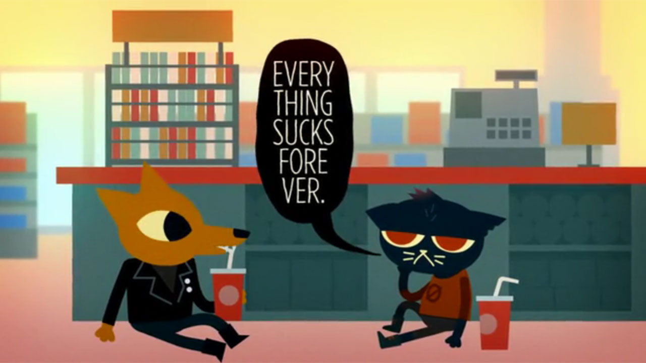
Tales Of Vesperia is an example of what happens when you want your game to look like a comic, but you can't afford to give text the same care as everything else. In TOV, balloons automatically pop over speakers' heads, with no regard for framing and composition. Sometimes a character moves while talking, and the speech balloon tail sprouts from their butt. Faces get covered by them in the middle of conversations that are supposed to be dramatic or important to the story.

How to fix this, then? Well, by hand-placing every bit of speech in every cutscene. An exhausting, time-consuming job nobody would want to do... Except for ROUTE 59, developers of Necrobarista.

Necrobarista is a visual novel about a supernatural cafe in Melbourne where the dead can have one last cup of coffee before moving on. It looks like an anime and it reads like a manga, with every click bringing you a new animated panel to read. It's difficult to describe, because there's nothing quite else like it.
"I approached my script as if I was writing a play," explains Damon Reece, friend in freelancing and Lead Writer of Necrobarista. "My script has a lot of stage directions in it. Then Kevin [Chen, the game's director] draws the storyboard, breaking my script in shots. Each "shot" contains information about composition, camera work and dialogue lines, which gets hand-placed in every shot." Once the storyboard is done, the team recreate the scenes in the game engine and iterate on them - posing characters and faces, tweaking animations and composition. The end result is absurdly stylish, half anime and half futurist poetry.
Necrobarista's approach has more in common with the way animated films are made than with traditional visual novels. It's highly unusual for a video game team to put so much care into the way text and images blend into each other. All too often, narrative designers work without even knowing how the words they have written will appear in-game, and I know this because I work as a narrative designer when I'm not busy writing here. My life is made of spreadsheets, and despair.
If you play a game where dialogues look weirdly nice, it's probably because some kind programmer wrote an internal tool that allowed writers to become their own letterers. Tools like Yarn Spinner made by Secret Labs for the developers of Night In The Woods. Yarn Spinner not only allows you to write dialogue, but also to control balloon size, position and formatting. Basic stuff, but it allows writers to decide how much importance to give to each line, and to compose expressive shots like this:
But not all lessons learned from comics should be applied to videogames. Different mediums have different needs, and our brain interprets them in different ways. Consider the work of Todd Klein, Sandman's main letterer.
Sandman is a comic about immensely powerful personifications of metaphysical concepts, and Klein created different balloon styles to capture each character's voice — like the wobbly, colourful balloons associated with Delirium. When, in later Sandman comics, other characters' fonts were digitised, Klein still hand lettered each of Delirium's balloons to make them look properly messy.
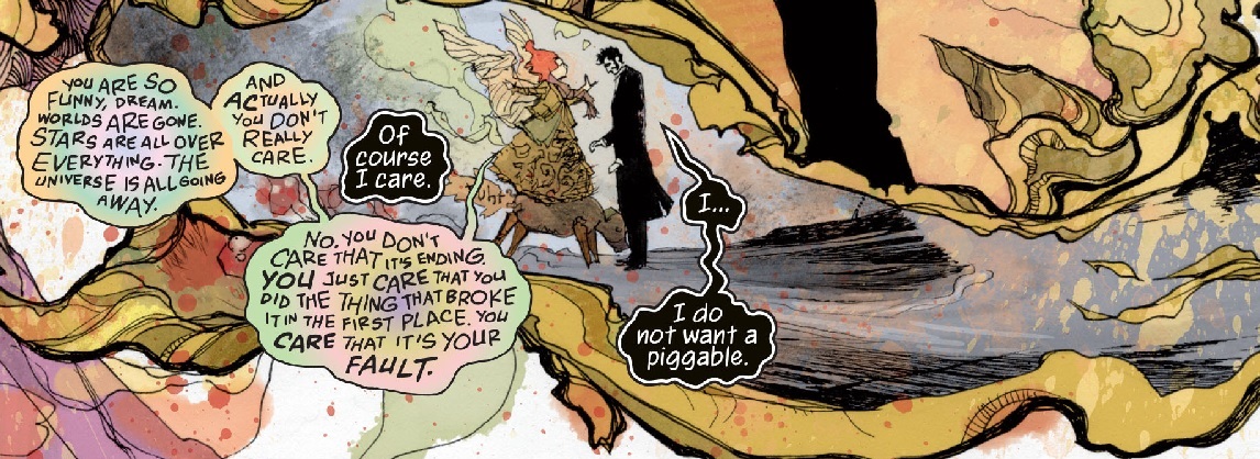
The end result is beautiful. I also suspect it wouldn't work well in videogames. In comics, dialogue is an integral part of the picture, as text and drawings work together or melt into each other for different effects. In videogames, all text is considered part of the UI — a level of menus and abstraction imposed over the game, not part of it. Windows with different colours and shapes would easily get misinterpreted by our brains as "something that is not a dialogue window", making dialogue more confusing instead of giving it more character.
I can only think of a handful of occasions where UI text elements are treated with the same level of importance as everything else in the scenes of a game. The moment when a character's hair blows over a dialogue box in Tangle Tower. The way the message box of May I Take Your Order? cracks the moment an Eldritch being appears. The way Badeline's hair in Celeste dangles out of the message window. The dynamic, shattering text in Katana Zero.
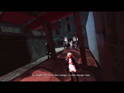
When you want your dialogue boxes to be a part of your world, you have to reconsider the relationship between images and text, and change your workflow to accommodate that. It's what the developers at Vivid Foundry are doing with Solace State. Solace State is a cyberpunk visual novel about mass surveillance, hackers, and a city fractured by inequality. Instead of using message boxes, the game's text is written directly over the walls of environments that unfold like origami.
"When I go through to the script, I start writing out stage direction of what I'd want the camera to show," explains Tanya Kan, executive producer, director and main writer. "During this entire time I'm gathering mood board pieces for art. What kind of buildings and architectural style I want, what kind of story I think their walls are whispering. But it's only after the first good draft of the script that I typically go in and doodle thumbnails."
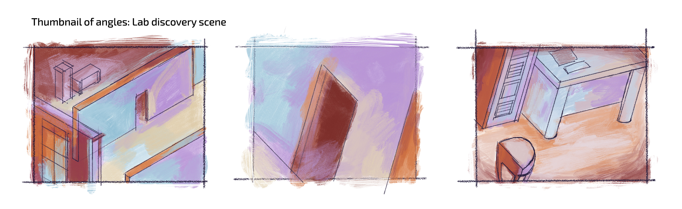
Kan says that level design only happens after the first solid draft because, at that stage, she's already started designing in 3D, and planned out suitable placement for each chunk of diegetic text. "Usually at this stage I go back and forth between the 3D models and the diegetic text, having a good idea of what is surrounding a piece of text at all times, because eventually the camera will pan," she explains. "And that transition itself tells a story. What buildings I put next to each other, what walls and objects I put next to each other, is important."
Solace State's twisting city reminded me of a short comic called Abstraction, by Shintaro Kago — an author I recommend you to absolutely not Google unless you have a strong stomach and a love for body horror.
In Abstraction, a simple comic page gets turned like a 3D object, revealing its grotesque interiors: giant busts cut to fit the space of a panel, giant hands poking from other panels, speech balloons taped over the scenes like signs.

This is a useful metaphor for how sometimes you need to make an abomination of your code just to make sure a bunch of text on a screen looks nice.
You can wishlist Solace State and Necrobarista on Steam. Their planned release date is yet to be announced.
Disclaimer: I know the Vivid Foundry devs because we met at the Toronto Comic Arts Festival, where they guarded my laptop while I was busy shopping. Thank you, Vivid Foundry, for allowing me to blow my paycheck over sexy vampire comics.