Battle.net client gets a nicer look
I am ready for the second battle


Blizzard and Activision's game launcher, Battle.net, hasn't won any "Sleek and Nice to Navigate" awards over the years. Blizzard have begun rolling out an update which could change this, though, as it'll spruce the ageing client up into a tidier Battle.net 2.0.
Announced on Blizzard's site, Battle.net 2.0 isn't worlds away from its predecessor, but I'm definitely a fan of the way games are displayed in a row along the top as opposed to a long list that runs down the left side. Plus the new library view looks grand, with its ability to filter games. I am genuinely excited for these filters folks.
It also uses space better in general. Select a game in the old client and you'd get tiny info-boxes surrounded by an expanse of nothingness. It's nice to see the gaps have now been filled by big news bits and colourful images.
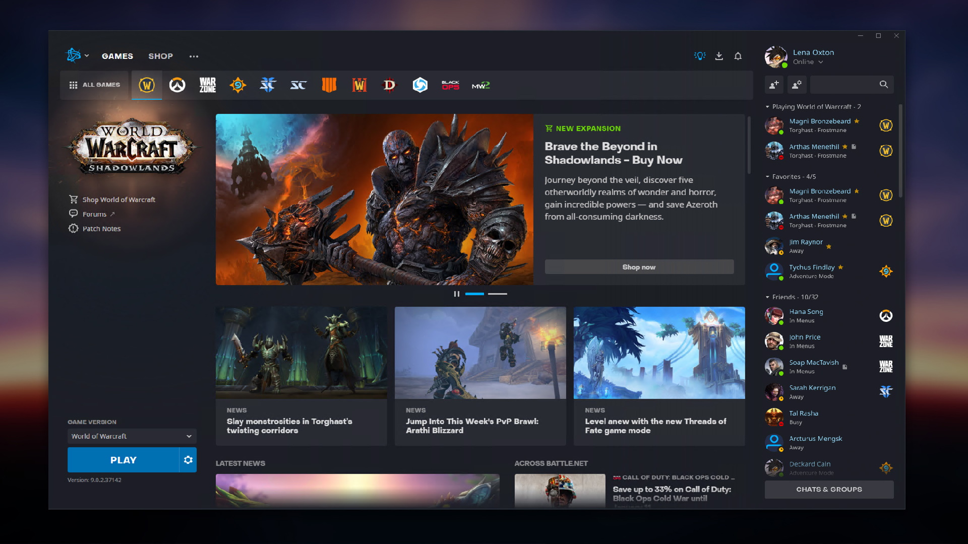
One of the most annoying things about the old launcher was its separation of the social panel, meaning you'd have to flip between windows to see what your mates were up to. Now all this stuff is neatly integrated on the right side. A big thumbs up from me.
Blizzard have also improved accessibility, meaning you can navigate most of the app with your keyboard. Screen reader support has been added too.
Here's a quick comparison between the two:


Looking at them both side-by-side, the old client really does look dated doesn't it? I can't get over that unused space, gah.
The new patch will roll out in North America first and arrive in other regions over the next few weeks.
