State of the Art: Old Man's Journey
How its gorgeous scenes were made
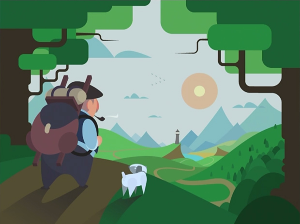
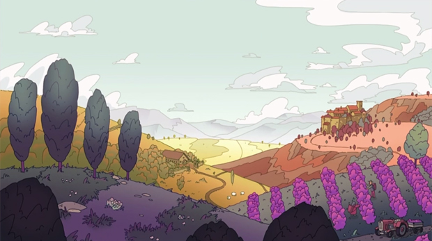
Old Man's Journey [official site] caught my attention before release entirely on the strength of its aesthetic. It reminded me of board game illustrations, of children's books, of a particular Courbet painting, and of colour palettes remembered from trips to the sun-baked south of France. The game itself offered a touching tale told through environment and memory as an elderly man strapped on his rucksack and headed off.
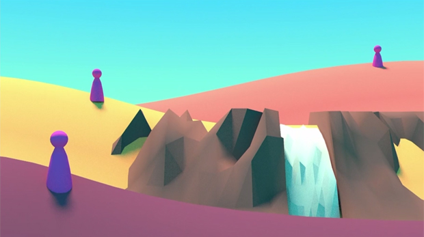
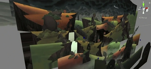
The landscapes you encounter are both the setting for the game and the game itself because you play by raising and lowering the layers of scenery. Where the curves of two layers intersect the old man can hop between them, dodging obstacles and navigating around errant sheep. I sat down with Clemens Scott, the game's art director, earlier this year to find out more about how he made the hillscapes work:
Just as an FYI, parts of this piece are information taken from the GDC talk he did about the game's development just before our interview augmented with my own observations as a player. He actually answered a lot of the questions I'd had as part of that presentation so we used our interview time for a) fleshing out some of those ideas and b) finishing slightly early so we could go on the beautiful LeRoy King Carousel outside the Children's Creativity Museum next to the conference centre. Fun fact: you can donate money and thus name an animal on the carousel for a whole year. If I could afford to do that I would name one of the camels.
Back to the game art!
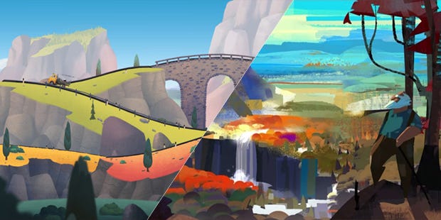
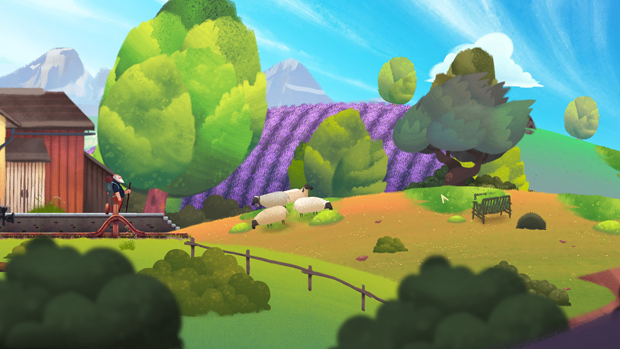
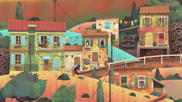
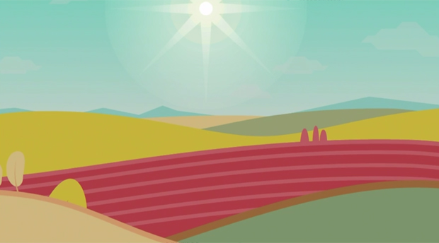
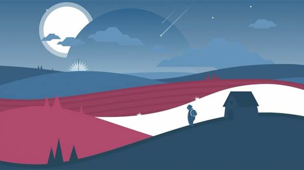
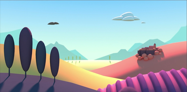
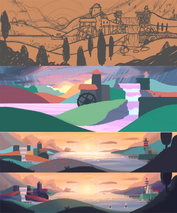
Okay, so here are some screenshots from the finished game:
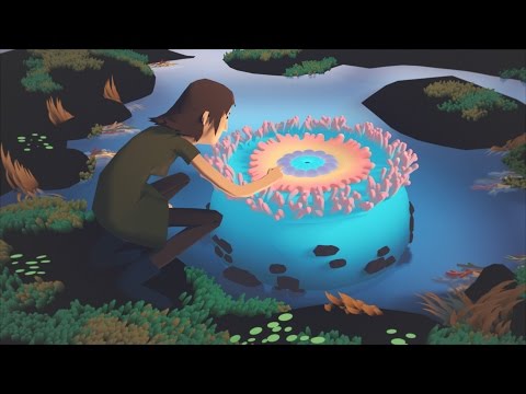
And here's a gameplay teaser trailer so you can see how players interact with those layers as part of the game:

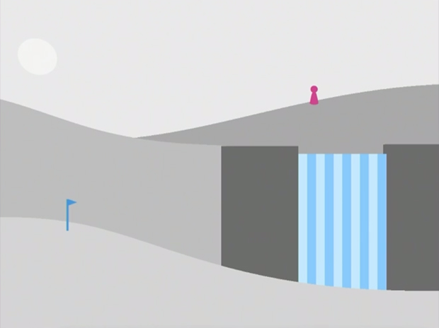
But here's the starting point:
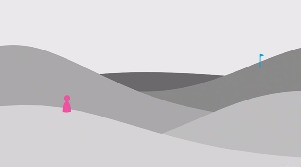
To go from those monochrome humps with the little pink figure and the blue golf hole flag objective marker is one of those things which seems more straightforward than it was because fundamentally the elements are all still there and they use similar shapes, but they have been dressed to suit the game. However, as Scott breaks the art development process down, you start to understand how the aesthetic evolved and how the visual art supports the non-verbal storytelling.
That starter image actually reminds me of old watercolour exercises where you use various strengths of colour wash to create the suggestion of a landscape receding. If you like that sort of layering effect there's a lovely Twitter bot which George Buckenham set up called Soft Landscapes – it produces a new one every six hours.
Obviously that basic idea was going to need to be worked into a format which supported the idea for the game, though. Old Man's Journey needed to encourage players to head into the landscapes – a sense of wanderlust was important, especially at the beginning because it's what motivates the player to start. But the aesthetic also needed to encourage the player towards a slower playstyle, moving away from progress-oriented play and towards a contemplative mindset. Scott described the overall effect Broken Rules wanted as being "A game for the reading nook" which I really like.
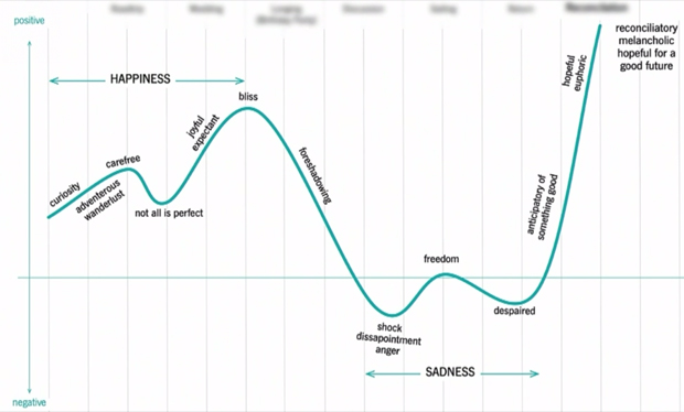
As a guiding thread for the game the team took inspiration from thatgamecompany and came up with an emotion curve for the game. The curve could then act as a reference point for conversations and decisions so that whatever was being created would be in service of the broader trajectory of the journey.
As the first step on from the initial set of grey layers, Scott turned to vector graphics. It was a method he was already familiar with from previous projects so it made sense as a starting point. That's interesting to me because it meant starting from the gameplay blocks and try to work up from that rather than heading immediately into more free-form concept art and working back to meet the game aims.
As you can probably gather the result was this bright and blocky image which offers up some legibility and there's an understanding of how the pieces might fit together as interactive components.
Here's another:
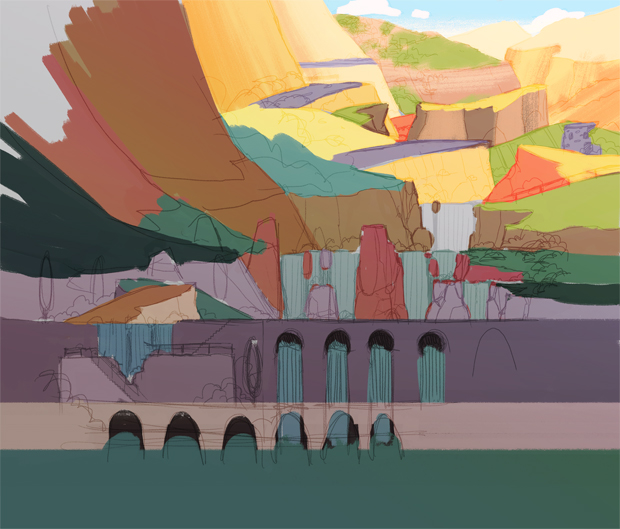
You can see a contrasting approach in the work by Lip Comarella from Salon Alpin, a production studio located nearby. He went with a far more painterly sketch which offers up a sense of mood and this idea of an expansive landscape ripe for exploring.

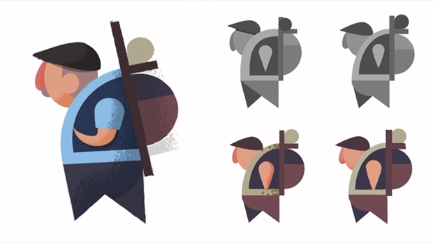
Scott explains that he then tried to bridge the gap between the two approaches, applying what he'd seen in Comarella's version to the more gamesy initial work. Comarella also worked up some concept sketches of the old man and other elements which you can see over on ArtStation. You can see how he has changed from the previous version and how the new look incorporates the fact that the team had, by this point, developed a far more detailed character profile to work with.
Here are the older versions with that blocky vector style:
And Comarella's version:
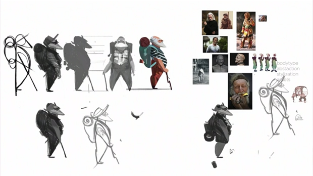
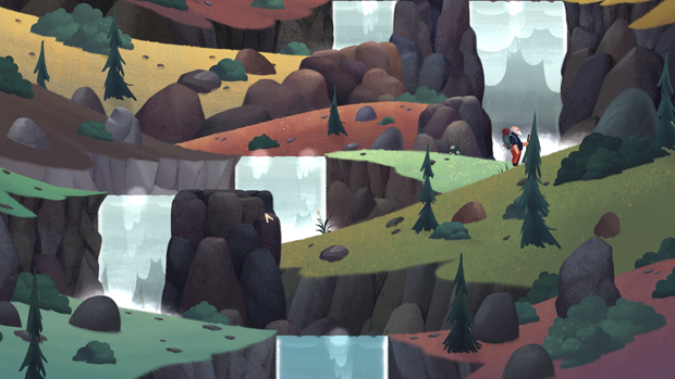
Here you can see how Scott was applying elements of Comarella's work to those functional templates for the levels. To give a little bit of explanation, some sections of the game have waterfalls. If you try to walk along the top of a waterfall the water knocks you off that ledge and you land at the base. It can either be an obstacle to avoid or a necessary element of traversal.
Scott's own verdict is that it was closer but still not quite right. He needed to find an art style which he, as the art lead, could make work (and which the rest of the studio could work with). Edging towards that stable style was very much a process of refinement over time, and in response to particular challenges.
One of the slides I really liked was this one:
It was from when the team were figuring out whether they wanted to work in 3D and so you get these character stand-ins who reminds me of Cluedo player tokens. But there's also something there, in the motifs and the colour palette which reminds me of Magritte.
Anyway, you then get to this image below which is attempting to solve the problem of giving a player something to head towards that isn't an artificial blue flag. That element was a short-lived success because although it meant there was a sense of direction and an object of interest, the appearance of a village meant there was now a scale that the old man would need to conform to as he hopped across layers of landscape distance. He would be perfectly distinct on the layers nearest the screen, but hopping backwards he would need to either shrink to being barely visible or tower out of all proportion over the rest of the scenery.
You start to see some elements that remained in the project, though. In particular Scott points to the colour gradients on the layers. It's easiest to make out on the yellowy layer in the middle ground which shifts from yellow at the top to green towards the bottom. The vibrant colours and this sense of light along the tops of the layers where you tread stayed in the game.
It's around this point that Scott points to the Panda Bear video for Boys Latin directed by Isaiah Saxon as another inspiration:
Line drawing experiments followed, and I think these images actually help show the problem of scale once you add detail. Over on the right you have a worker in the vineyard so the old man would need to be that height or risk looking bizarrely gigantic. By the buildings on the third layer back he would be so small you'd have difficulty selecting him and by the fourth layer which is the destination he'd be all-but invisible.
Looking to the village itself, I remember really liking how the layers lead you upward as you play. I'm so used to things which side scroll and there's a significant amount of that in Old Man's Journey but you do also get these lovely climbs and descents which provide a strong spatial contrast. They also remind me of tiny French and Maltese villages I've visited where I've needed to clamber up sun-bleached steep streets to reach a particular cafe or bed and breakfast. The pastel-hued Italian coastal villages of Cinque Terra were a direct inspiration here he says. The header image on the Lonely Planet page about the place is absolutely gorgeous.
Having an environment with these steep pathways interspersed with overlapping buildings was useful in teaching players where they can stand while manipulating the slopes. Roofs were consistently safe, immovable objects while roads and paths could be raised and lowered as long as you weren't standing on them.
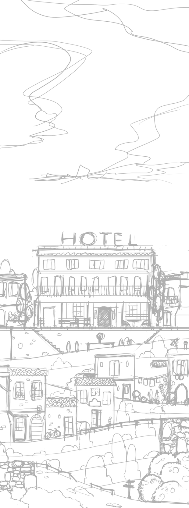
Scott started with a smaller sketch and then extended it at the base and at the top so players would have a place to come from and a destination in the hotel which sits at the very top of the building. The expanse of sky is part of building that feeling that the space continues even if the player can't reach it.
The top of the village was where one of the less successful 3D experiments came in. There's a little camper van which comes and picks a guy up and you can see in the gif below a little gif of the van going back and forth, but the way the 3D is functioning, you see a lot of one side of the van and then the other - far more than you should if the van were travelling in a straight line. To me it looks like it's both going in a straight line and moving along a really pronounced curve to get that effect. Eventually the decision was made to stick with 2D for most things.
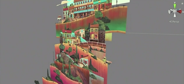
That said, the way the landscapes are made utilises the kind of layering that makes me think of theatre sets, with receding landscapes on a shallow stage, or decoupage where layers of paper stack up to give an image depth.
The 3D effects on the individual elements are accomplished with shaders and so on in similar ways to traditional illustration. For example the bushes are lighter on the top than on the bottom. You layer different bits of bush, each with their own light-to-shade gradient to create the illusion of depth. So as not to have to hand-colour each one for each scene they're actually monochrome and then there's a shader which applies the colour. Here's a gif I made from the individual steps so you can see how they build as well as an image to show that same set of basic ingredients just with a different colourway applied:

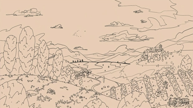
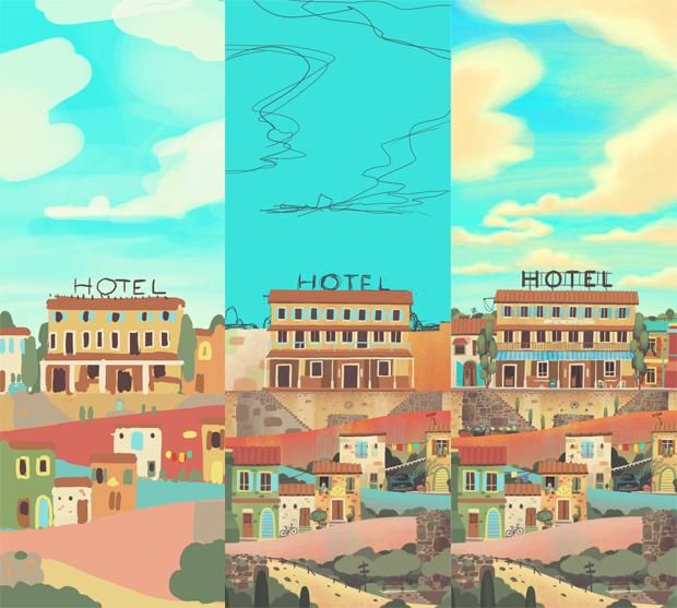
But in terms of creating the broader landscapes in which those assets would sit Scott would stitch the puzzles for that level together as in Photoshop to create the basic skeleton and then sketch the landscapes on top of those digitally.
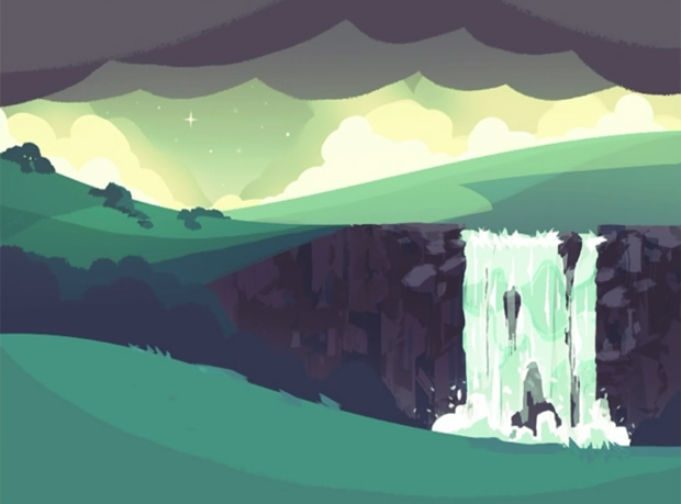
In this particular scene you're heading downwards, both physically via the waterfalls but also along the emotional curve we mentioned earlier so the colouring of the world goes from this warm and bright palette at the top to this blue-er, colder one at the bottom.
There are also checks for player legibility at this point, like making sure all of the overlapping hills are of different colours so they won't blur into one another as the player fiddles with them. You can also see how Scott was adding detail, extending the colour range a touch and so on.
What each of these scenes builds into are these beautiful, coherent vistas which fit so well with the emotional tenor of the story. When Scott and I were sitting by the carousel later on I asked whether any of the references I used to explain the game to other people were things he had drawn on while actually creating the look - any Courbet? Any Dixit cards?
He says not consciously and then adds that another reference he didn't have was Song of the Sea, the gorgeous animated film about a little boy with a selkie for a sister. Song of the Sea is a point of note because Scott didn't see the film until a few months ago, so well into the life of the project and after the art style was formed, and yet he notes "If I'd seen this before, this is what I had in my head but hadn't articulated!"
Generally what Scott has been talking about up until this point is the interactive part of the game; those malleable landscapes. But the traversal is punctuated by moments where the old man sits down and contemplates a memory. It's through these that you chart the course of a particular relationship which informs the journey. But in doing so the developers must take control away from the player and encourage them to observe the scene.
Some of the priming for reflection is done in the pacing of the game. The man moves relatively slowly and the game itself is more about meandering through lands rather than figuring out tough puzzles or mashing commands so sitting back isn't jarring like it can be in an action RPG.
In the released version of the game the team had settled on the memories appearing on screen in this different, far more painterly style, which gives them a dreamy, narrative quality. You can either linger and look or, if you tap the screen it brings up the button to press to go back out of the memory.
I love these memory scenes but I still found it hard to break out of the interaction mindset. I definitely moved time along without thinking once or twice, just because I was in the habit of clicking and responding to prompts. I found myself wishing the game had a kind of photo album once you'd finished the game so you could go back through the still images to tell that story and revel in the details.
Here are a couple of images so that you can see what I mean but obviously SPOILERS!

The other thing I'm still not sure about is how successful the art and the story combined with the mechanics of the game. I went into this in greater depth in my review but essentially I think it works better on a touch screen device but that the movement still doesn't really add much to the experience and you end up faffing with sheep far too much.
I asked about the balance of interaction and aesthetic/story when I spoke with Scott, although it was before I had played the full game so we didn't go into full detail:
"Our motive for the game design was to keep the puzzles always interesting but never frustrating. There are no brain-twisters in there. It stays on this level of experimentation, figuring out how it works," says Scott.
"I think now that I see it it's just the right amount of gameplay to transport the story and the narrative and to keep it interesting. Also to justify it as not just a walking simulator because every single screen has [a puzzle element] which is a variation on the existing mechanics."
That said, he adds that it was always going to be a tough balance to strike - if you're gaming literate you might find it way too easy and if you've never encountered spatial perception puzzles of this kind you might find it harder to get to grips with.
One last element which came up several times over our conversation was the idea of creating an art style to suit each game at the studio. The idea inched into conversation I think because I was hoping there could be more of these scenes and vistas in my life but Scott prefers to get to grips with one thing and then move on rather than applying an existing style or having something recognisibly "Broken Rules-y".
"Many artists have to have their recognisible style because that's how they sell themselves and it's what people are looking for when they want a specific artist – maybe it's more contemporary art where that is the case," he says. "[But] if I feel I've explored something long enough... I like to learn new things and experiment."