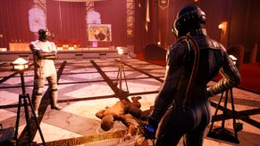
Check out the gorgeous loading screens in The Outer Worlds
Now listen, see
I understand that Obsidian fans are sort of using the existence of The Outer Worlds to dunk on Fallout 76 (because OW is the real successor to New Vegas, right?). But before it was ammunition in a weeing contest, the game was a first-person space RPG where you did a shoot at extremely angry lizards. And, much like that one friend we all have, I thought it was a lot of fun, but relied too much on tropey rib-nudges in lieu of having its own personality. So far, so space cowboy.
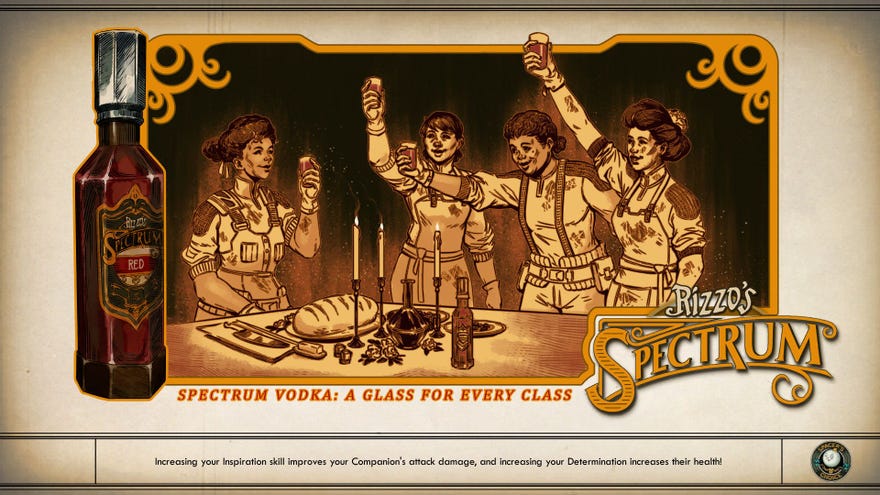
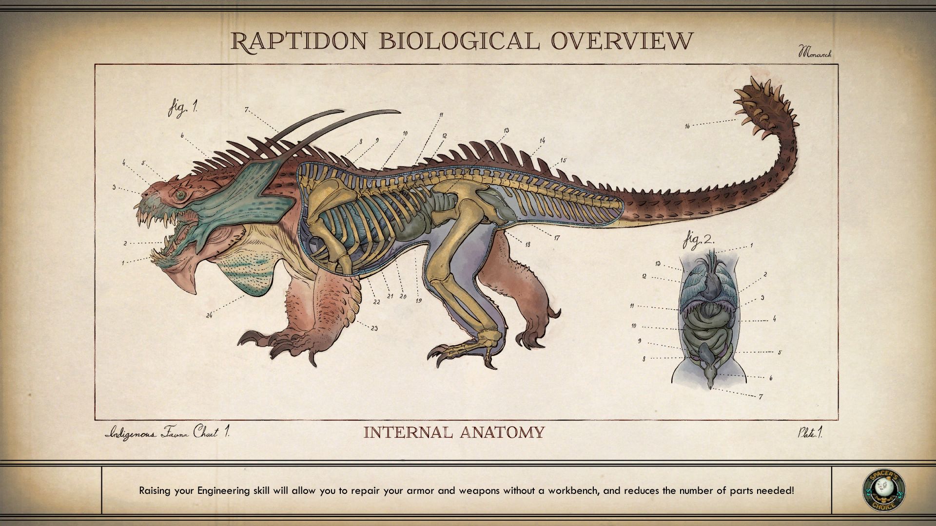
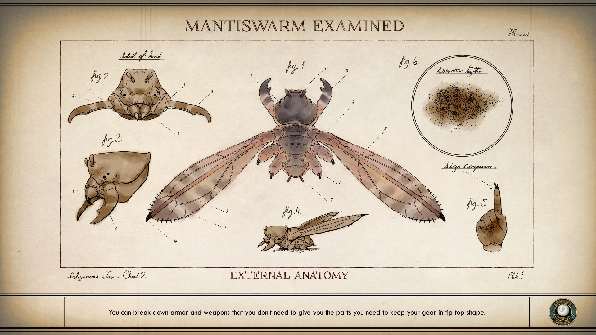
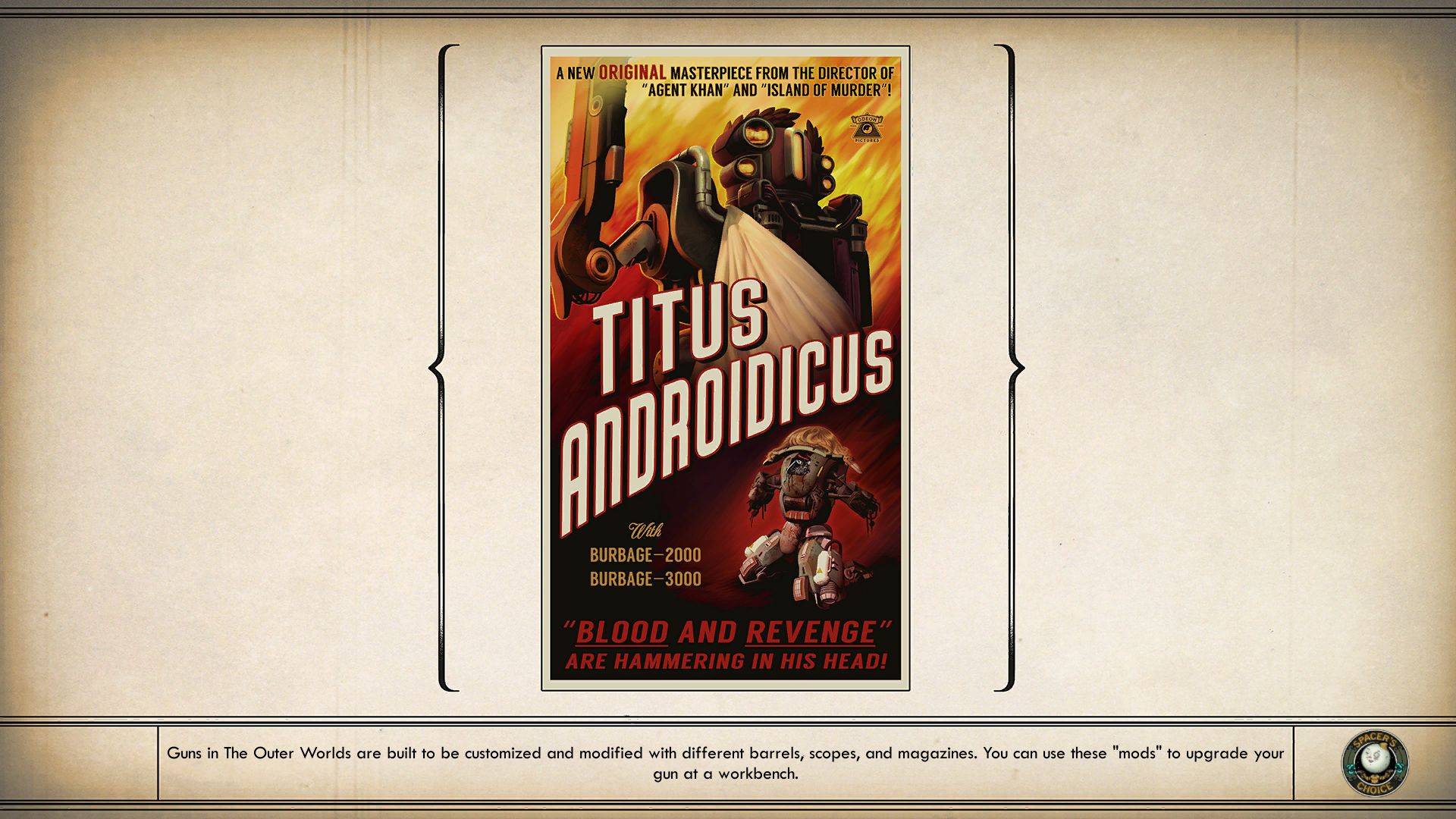
But one thing about The Outer Wilds that utterly delighted me was when I had to open a door that led to a different area. Because then I got to see a loading screen. And they're the purdiest-lookin' loading screens I ever did done saw.
Developers long ago noticed that a blank loading screen with just a spinning coin in one corner is a bit naff. We, idiot meatsacks with ever-shortening attention spans as we are, are liable to get bored and wander off if there isn't something interesting happening on screen every two seconds. So a lot of games put something else there instead. Call Of Duty, for example, has long plumped for showing meaningful quotes from people like Gandhi and Winston Churchill -- who were, famously, best mates. (I got very specifically annoyed at the current entry, Modern Warfare, because it attributed "Cowards die many times before their deaths; The valiant never taste of death but once" to Shakespeare, rather than Julius Caesar as written by Shakespeare. Like, yes, technically, but come on. "Until last night, I have this twelvemonth been her bedfellow." - Shakespeare.)
I must assume that a lot of artists on The Outer Worlds are possessed of a "stand back and watch this!" energy, because all the loading screens are truly beautiful illustrations. Some of them are diagrams of the local space wildlife, and I can almost imagine the biologist who drew them. Big ol' space Darwin type.
Honestly, they have no business being this lovely when they're just there to give me something to look at when I'm getting on and off my spaceship. But I'm not going to complain. Sometimes they're ads for movies or serials, like this one for Titus Androidicus. Very Futurama of them.
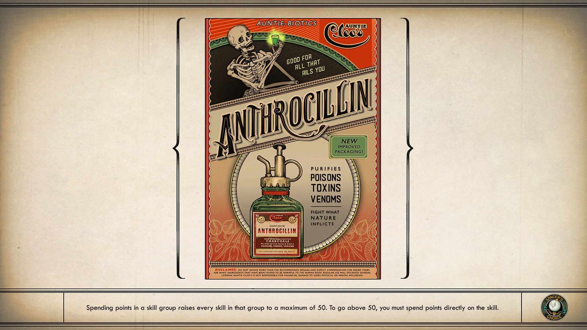
A lot of them are ads for different fake products by the megacorps lording it over the game's setting, and one of my favourite things is that they have, like, recognisable brand styles. Auntie Cleo (which has a medical brand called Auntie Biotics) uses a lot of red, and their ads are in portrait, like this unsettling one for Anthrocillin:
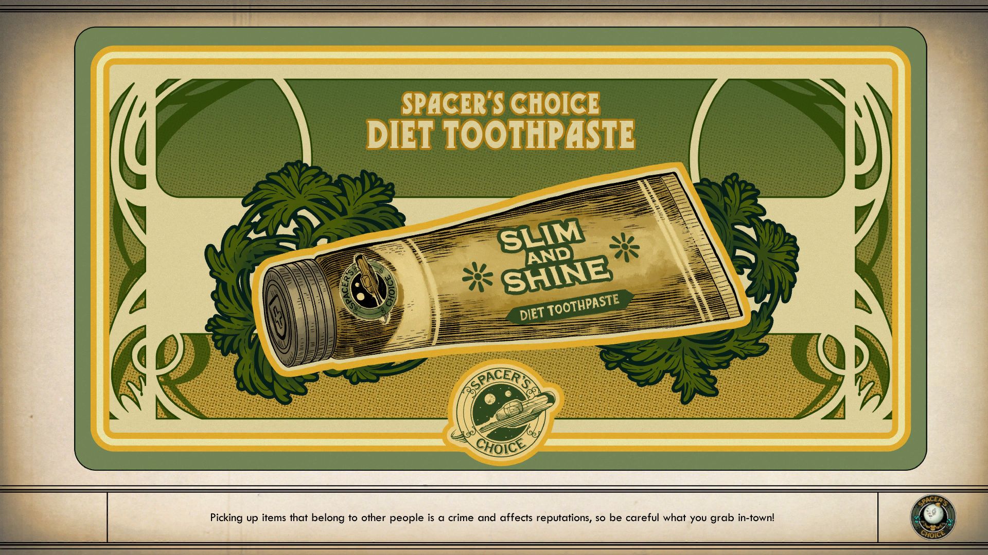
Spacer's Choice favours a landscape style, with more green. Marvel at the line work in this piece, reminiscent of that Absinthe ad everyone has a print of, but for a diet toothpaste that I think is parsley flavoured??
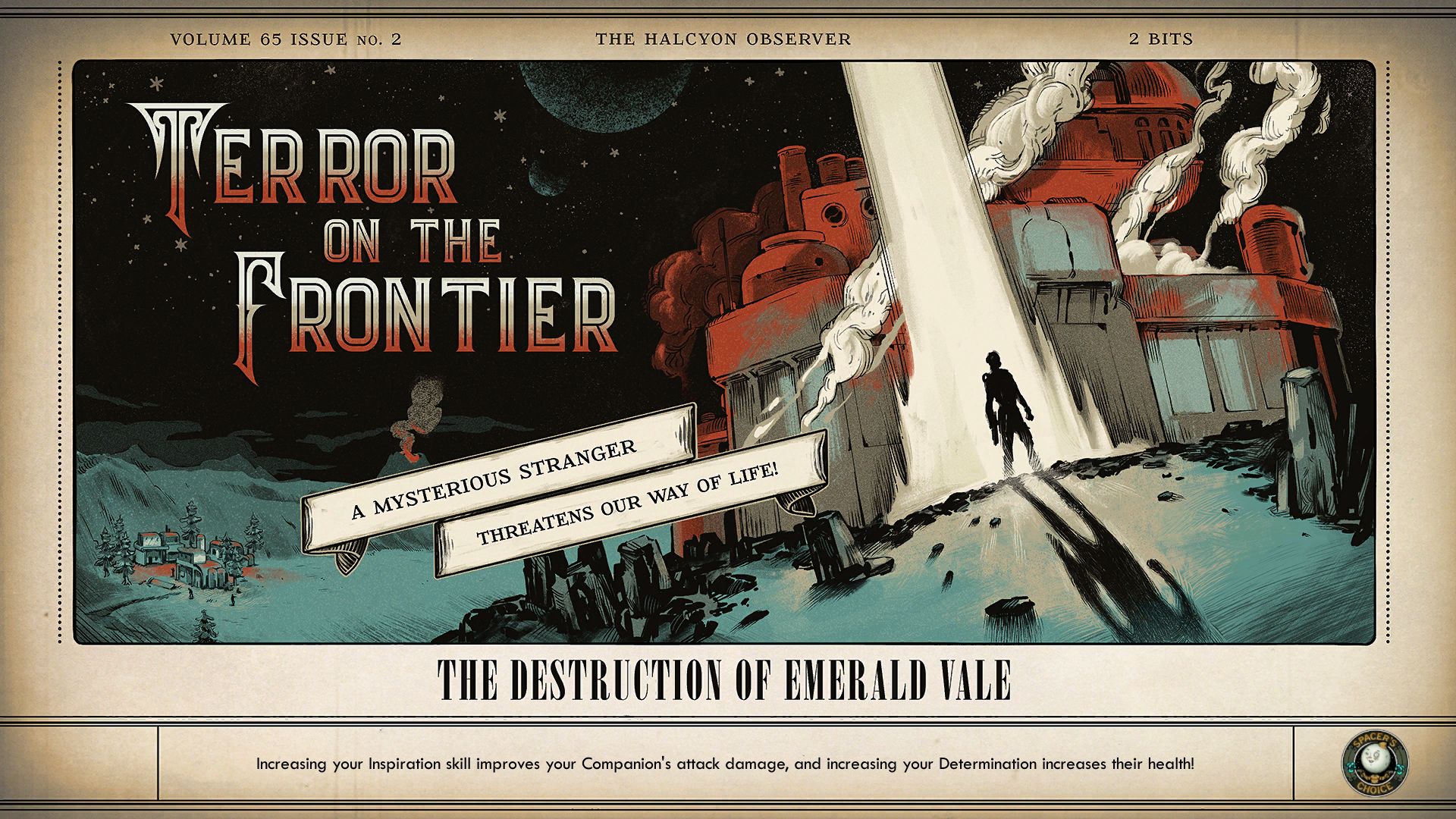
Also, and -- extremely mild spoilers for some quests, I suppose -- there's a Halcyon newspaper that reports on the stuff you've been up to in the plot. It leads with exquisite blue and red pictures. Imagine if the The Evening Standard looked as nice as this. I bet it wouldn't get left on the tube as much.
I mean, technically it's all propaganda, right? But hot damn, what good looking propaganda!
