State of the Art: Lights, action, razzle dazzle with League of Legends' VFX
Flickers and flashes

Visual effects in games intrigue me - they contribute so much to the flavour of a character or an experience but often they're at their best when you're not consciously registering them - they need to complement and harmonise and blend... In a game like League of Legends [official site] they need to communicate character, telegraph attacks, fit in with the established vocabulary of more than a hundred other champions and let the designers further customise them to create themed skins. Jason Keyser, a visual effects artist at Riot who has been working on champs like newcomer Camille explained to me just a little of what his work entailed while he was over for League Fest earlier this year:
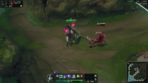
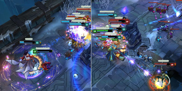
(Just so you know, most of the images in this post are from me leaving Fraps running during an ARAM match and taking a closer look at the spell effects I caught. It was a curious thing as I process most of what I see on that front unconsciously!)
Pip: Hi Jason, can you tell me a bit about your day-to-day work?
Jason Keyser: Sure. I am an artist and I work on the champion team. So I work on the visuals on the game. Artists on the champion team are highly specialised so there are a handful of types of artists on each team, usually around six. There's the concept artist who draws and paints the character in 2D. Then there's a 3D artist who builds the character in 3D and textures it in 3D. There's a character rigger artist who puts the bones and muscles in the character like putting the strings on a puppet. There's an animator who animates it and brings it to life - makes it move around. Then, after all those guys do their job I come in and put the visual effects on there. So all the magic, water, smoke, fire - whatever! - flying out of their weapons and fingertips. After me there's an audio designer who makes all the sound effects.
Pip: I'm assuming a lot of your job revolves around making the abilities legible to the player and to other players in the game...
JK: Absolutely. That's a huge priority.
Pip: How does that work? If you could take an ability as an example and talk me through choosing the right colours, the right particle effects, anything around that?
JK: Oh gosh. Which example to choose? There's so many different times when we have an idea as an artist that we love and we think is beautiful and amazing and impactful and gorgeous and it's great! Then we do a playtest and we can't see anything else because the beautiful, gorgeous, amazing effect is covering the screen and no-one knows what's happening and why they're dying or what's going on underneath all the magic and particles. So we have to rein ourselves in and not get too fixated on what we want but rather what's best for the game when we're making art.
Some other times it gets even more technical. Say, for example, on Bloodmoon skins in general they use red magic, but if you're an ally you don't want it to be red for you because that's what shows it's from an enemy. When there's a red ability on the map usually that's an enemy ability and Blood Moon skins struggled with that so we had to find ways to mix in blue so it looks friendly to allies. The enemy version is totally red.
Pip: Are there any abilities or effects that were particularly challenging to work on?
JK: Yeah, so probably my favourite to work on was PROJECT: Leona's ultimate where she calls down sunfire to blast her enemies. For PROJECT: Leona we wanted an orbital laser kind of feeling so it was really fun to play around with that. A lot of iterations were thrown out and we tried different things that looked all techy on the ground and everything, but at the end of the day it didn't feel like sheer energy coming down on you, so we focused more on the heat of the energy pounding down into the ground with more subtle technical elements to make it feel like it was from a PROJECT orbital laser and not just a regular one.
Pip: The moodboards and the research for that must have been really interesting.
JK: Oh yes. Reference is a huge part of making art. It's something I talk about with students a lot because students want to do something new and innovative and I think that's admirable, but even professionals understand reference is key. Whenever I'm walking by someone's desk - any kind of artist - almost always they have what they're working on on one monitor and then reference on another monitor to inspire and inform how to do the thing they're trying to do. Because someone else has done a Mona Lisa already and you want to create something that evokes all the same emotions as that Mona Lisa it would be silly to not reference it. Of course we never want to go without references. That's industry-wide. It's pretty standard practice.
Pip: As someone who works on the game how do you watch League of Legends - are you keeping an eye out for the effects and anything which might need changing?
JK: Recently [at the time of the interview] on the front page of Reddit there was a complaint about PROJECT: Ashe's ultimate not being legible, not being clear. You can guarantee if it makes it to the front page of Reddit we see it! [laughs] The feedback is received for sure. So that has been very much discussed and iterated on. We're putting out a version which should be more clear. So yes, we are players ourselves so we're out in the community trying to understand where we can improve and get that feedback into the visuals as best we can.
Pip: Is it part of your work to take into account people who might need colourblind modes or is that handled by a different team?
JK: Colourblind is definitely a consideration we make in our games. Sometimes it's obviously very challenging, matching reds and greens for that type of colourblind because, say an ability thematically is red and the ground is green, the grass is green underneath it and they blend together, so we try to do things like shifting how bright one is over the other, or how dark it is. Some cases are more difficult than others because of other factors like if you make it really dark it might be too much but if it's not dark enough it gets lost in colourblind, so it's about weighing and balancing the importance that each ability carries and trying to have a good understanding of the gameplay and not making it fall out of line. We have a way of simulating colourblind on the tools we use to see what they're seeing.
Pip: A lot of what you work on isn't necessarily what players pick up on consciously. Are there any small or subtle aspects to your work which have a disproportionate impact - colour coherence, maybe, or visual cues in the windup on abilities, or particular shapes? Stuff that's so little players don't consciously pick up on it but it makes a massive difference.

JK: I think what you've just said is all of visual effects! It feels so strong but there's so many little aspects that go into it. You want to have variety of colour, you want to have depth, you want to have punchy timing. The artist who did the glow coming off the eyes on Braum's shield - these little trails of glow that sort of emanate off everywhere he goes.
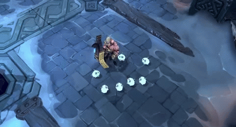
[This gif is from an animation section rather than gameplay but you can see the eyes:]
It's these little touches that add the flavour that make the emotion it reads as. We know we've done our job well if we're getting the emotion we were going for. If players are using words like, 'I felt really sharp when I did that, like I was slicing through.' That's great because the character is just putting its arm out with a weapon but the effects have sharp lines in them and those kinds of things to try to convey that.
Pip: So you're shooting for adjectives? Katarina would be sharp, but Braum you'd maybe be going for 'hefty'?
JK: Yeah. We really have a clear set of goals as a team and then every different discipline works in concert to hit those goals. If, in playtests, people are not responding that those goals are met as outsiders who don't know the goalsthen we know we need to find some other tactical approach, whether it's a different shape, a different colour, different timings [or something else].
Pip: Thank you for your time.