State of the Art: Thumper's Bio-Metal Art And Insects
How its unique look was developed
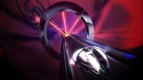
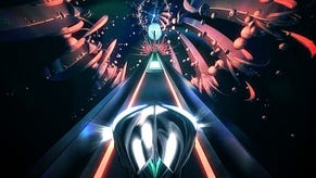
Rhythm action beetle adventure-coaster Thumper [official site] is one of those elegant games with great core mechanics. I think a lot of people have been commenting on how it's made them feel or on the slickness of the interactions, but I wanted to zero in on the look of the game. It's this pared down bio-metallic thing, somewhere between a heavy metal album cover and a chrome-infused minimalist bar which ends up at sleek but unsettling. To delve deeper into Thumper's aesthetic I spoke to Brian Gibson, the man behind the game's art about colour, speed, focal point trickery and more!
As with all our art-focused features, just click on the individual images for a larger version:
Pip: Thumper has a really distinctive look - I'd maybe call it bio-metal because of the mixture of chrome finishes and organic-looking elements - but I'd be interested in how you think of it as well as your influences?
Brian Gibson: Bio-Metal seems close, it makes me think of H.R. Giger's "Bio Mechanical" style. I'm sure his influence is in there, but I was definitely going for less bio. Maybe more dreamlike, mental-mechanical? Psycho-mechanical? Something that conjures fear because it looks more like the product of madness than anything else.
Pip: Can you tell me about the evolution of Thumper's look? Where it started and how different it is from that now?
BG: At first I knew I wanted the look of the game to be dark, but I was thinking it would be a gloomy stone block path winding through a cloudy atmospheric world. Our path was going to be built in segments, so using stone blocks made sense. A few years in, we developed a system for making the path segments curvy and perfectly contiguous; suddenly rigid blocks made less sense. So that's when I started to develop the sleek, reflective look.
Pip: The player avatar is a little chrome insect - can you tell me about how you ended up making that decision and why?
BG: It was originally the suggestion of my friend Mat Brinkman. The beetle satisfies a lot of formal requirements for the main character: low to the ground so you can see the cues ahead of him, a simple and roughly circular shape so it's easy to parse target as the cues pass underneath, iconic, unusual. It just seemed perfect. Mat even helped with some of the early concept sketches, he's one of my favorite artists so it was awesome to have his input.
[These are two of Brinkman's sketches - the insect wing sketch further down is his too.]

Pip: I'd also be really interested to see the bug's evolution, or sketches you made along the way while working out how the wings work - the animations where they get ripped off and where they come back, for example, as well as when they splay out if you're holding the up key...
BG: I don't know if any early beetle sketches exist anymore. Mat made a few, and after that I did a few generations of models that tweaked his design, mostly to account for the weird POV in Thumper. Because we don't have a way to export animations or use bones or anything like that, I made all the beetle animations in our engine.
Basically rotating the shell and wing meshes along a pivot point. Or just translating them from off screen when you regain your health. When you fly there's an effect that suggests buzzing wings, it's a basic material animation on a transparent plane that makes an impressionistic suggestion of fluttering insect wings. Thumper effects are all very low tech like that, no fancy shaders and no particles. When the shell shatters, I'm actually hand animating individual instanced meshes.
Pip: In terms of the actual elements in each level, can you tell me how they work? As a player it feels like you've got a library of elements that can be bolted around the track and then those get remixed according to both the level difficulty as the game goes on and maybe each level/level section's identity...?
BG: We have a few core gameplay elements: thumps (white squares), turns, red bars (you slide through), blue rings (you jump through). The process of level design was authoring these elements on a grid UI into short sequences as you would in any step sequencer. Those short sequences are then placed on a timeline, repeated, twisted, and arranged into a larger composition. Over time all the patterns became a library where I could take an old pattern, copy it, and tweak it, and place it somewhere else.
Every level has a few characteristic rhythms that are introduced as repeating themes that develop as you progress. At any time they may reappear with an unexpected twist. We wanted the player to feel a mix of control and uncertainty.
Pip: How did you settle on the balance of organic-looking elements, like the tentacles that flex around the track and remind me of ribs curving around a spine versus the geometric tubes?
BG: I guess in my mind it's all the same dreamlike, mental-mechanical stuff. The tentacles, tunnels and bosses are like sprawling appendages of this singular id-organism.
Pip: There's a brilliant sense of speed and movement to Thumper - can you tell me how you used the art and visual effects to augment that?
BG: Creating a sense of speed involved multiple variables working together. The most powerful tool for tuning speed was literally stretching the path. Because we built a custom system for generating the path by instancing a string of contiguous slices, we could elongate each slice and therefore tune the distance traveled over a unit of time by tweaking a single variable (without disrupting the beat grid). The camera's field of view also has a huge influence over the sense of speed, but it's hard to describe why without demonstrating, but a wider angle has the effect of making space feel deeper, and therefore moving into that deeper space feels faster. Things like camera shake, radial blur, motion streaks and making the beetle itself vibrate were more superficial attempts at selling the sense of speed.
Pip: Can you tell me about the colour palette and how you settled on that?
BG: I think limited palettes always communicate stronger mood and atmosphere. I think once I decided on the look of the sky, a lava lamp blend of saturated reds blues and greens, I thought a nice way to constrain the color palette would be to make the game world out of surfaces that reflect the sky. One exception is the chrome beetle, which is a higher contrast greyscale reflection, which I did to distinguish it from everything else and make it stand out as the center of attention in the frame. The other exception is the effects and gameplay cues which needed to be very bright and saturated for legibility reasons.
Pip: I'd be really interested in elements that were stripped out as development progressed - was there anything that proved too visually noisy, for example, or any effects that you loved but weren't quite working for the experience?
BG: Yes, on a high level, I wanted all visual information on screen to be relevant to the gameplay somehow. I think as an artist it's easy to want to fill every available space on screen with something cool, but ultimately empty spaces are a necessary part of a good composition. In the early versions, there were more arbitrary props floating by, but they didn't signify anything meaningful and that bothered me. Eventually anything non-essential was removed. That's also why we made it so you can always pound and kill any tentacles you see for extra "Kills" points. Otherwise the tentacles are a meaningless distraction in the context of the gameplay.
Pip: The gameplay elements like the side walls and the lights that signify jumps are obviously vital for the player to see so can you tell me how you made sure the other elements didn't interfere with legibility? Any lighting or focus effects, for example?
BG: We use post-processing tricks to direct your eye to the specific the area in screenspace where the cues appear. The closer anything is to that critical region, the brighter and higher-contrast it will become. There is also some radial blurring that literally makes that central region the most focused area in the game.
Pip: Relatedly, I'd be really interested in how the design and the art design interacted - some segments take place in tubes rather than open areas and I assume that's to add variations in difficulty, so was that a case of working out which bits needed to be harder and then working out how to do that through artwork/play, or was it a case of knowing those bits needed restricted view and just figuring out the look of the tunnel? I'm trying to get a feel for how the art and the game design interacted.
BG: The tunnels restrict visibility to some degree, so often the tunnels would be used as a twist to test one's mastery of patterns. But more importantly, I wanted big sweeping changes to the surroundings to enhance the drama of passing through space. Passing in and out of tunnels, with a giant whoosh is something you can feel viscerally without needing to look away from the important parts of the game.
Pip: Given Thumper is a game where players are steeped in the aesthetic but can't stop to examine it, how does that affect your work or how you approach it?
BG: The fast moving pace allows the representation of the game world to be impressionistic rather than realistic. The blurry light streaks and streamlined forms create this iconic look that idealizes the feeling of whizzing through space at an incredible speed. Kind of like something you'd see hand painted on an Atari cartridge for a racing game. Any time I tried adding details to the geometry, like rough textures or refinements, it detracted from that specific iconic, impressionistic feel I was looking for.
Pip: I've noticed there's vignetting in the corners of the screen - far more so at the bottom of the screen than the top - is that to guide the player's view or to give the sense of the camera being on the track and the track edges curving round or perhaps something else?
BG: The vignetting, or darkening as you move away from the center, is there to control the players focus. Anything bright or fast moving is going to draw your attention away from the task at hand. So by darkening and minimizing those arbitrary peripheral distractions, we could replace that surplus attention bandwidth with higher speed and gameplay intensity. In other words, we replaced the frustrating challenge of "arbitrary distractions" with the more exciting challenge of "faster speeds" if that makes any sense.
Pip: Can you tell me about the evolution of the boss design?
BG: I wanted the giant disfigured head (Crakhed) to act like a reflection of the player, and as the player progresses, they confront more disfigured versions of themselves as they descend into deeper stages of game addiction. Maybe the poetic statement here is that the best video games reveal a monster hidden inside of ourselves. I think that's why this mental-mechanical dreamworld works so well. It's like the game is showing you an unsavory and mechanical aspect of your psyche that needs to be overcome, and it gives you the tools to overcome it. You start off as that frustrated monster, but if you work at it, you eventually come out the other side as a god. I could go on and on with this subject, but it's only one interpretation.
Most of the miniboss designs are the result of tinkering with the custom tools we built in our engine. Using the step sequencer to arrange the segments of a giant zillapede, or the arms of a starfish. I did no concept drawings for any of these, because I was mostly interested making entities that were unique to the tools I was using.
Pip: And finally: Which is your favourite section in terms of how it looks and why?
BG: I like the level 3 miniboss in VR, because it's a simple abstraction that, when scaled up becomes something more. At that vast size it appears powerful and inexplicable. In my opinion, the most revolutionary thing VR offers is a true sense of scale. Everything you see in VR has a size that's relative to the distance between your pupils, and that's something the traditional picture plane could never convey.
Pip: Thank you for your time!


