Behind The Spells In Mirage: Arcane Warfare
I put a spell on you
A quote which stuck with me from GDC was Torn Banner's studio president saying he wanted the magic spells in Mirage: Arcane Warfare [official site] to feel like "throwing bricks at people’s heads" and not like using pixie dust. A significant part of creating that difference will lie in how the Chivalry spiritual successor uses art and animation so I've asked members of the art team to explain how that works as well getting bonus insights into how the aesthetic of the game works more generally.
Weighing in on the discussion are Darin Walsh (UI and effects artist), Brandon Phoenix (technical artist), Jason Lavoie (environmental artist) and Dylan Brady (character artist). Nearly all of the images have larger versions so just click on them for a closer look.
Pip: Hi! Can you talk me through the basic visual/aesthetic principles behind the spells - their essential visual style and how you got there?
Darin Walsh: Early on in production we established visual stylings for each class depicted in this early concept piece:
We went on to change a few of these but our basic goal was to create a spell style for each class that would match their personality and play style. This gave me a good jumping off point for each spell. When it came down to creating the individual spell visuals my first and foremost priority is depicting the functionality of the spell. So if the designers bring a spell to me that is a large AOE (area of effect) spell that does damage and pushes players back, I need to make sure whatever I create looks like it is doing that function. This seems obvious but becomes tricky with spells that have multiple - and sometimes more subtle - aspects to them.
After I have created something basic that shows that functionality I figure out ways to infuse the individual class styling into the spell. So for example the Vigilist’s Disperse ability, I created a cascade of crystals jutting out from her feet that disperses outward shoving nearby players. This matched the visual styling of the Vigilist (crystal) and shows to the player exactly what the spell is doing.
Pip: In a previous interview Steve Piggott was telling me you wanted to make magic feel like throwing bricks at someone rather than pixie dust. Can you tell me how you tried to build that sensation into the artwork?
Darin Walsh: This was a tricky one to solve. What a lot of games do is to rely on particles for most of the spells - which was my first instinct too. The issue with this is the spells felt more ethereal and had less of a presence in the world. So we decided to add a physical element to almost every spell, that way it would look like it had weight and physicality to it. A prime example of this was an early spell we worked on called Chaos Orb. We could have created just a typical fireball looking spell that people would see in any game with magic but instead we created a casing that contained the energy of a fireball. That casing was inspired by a real life object that I have sitting on my desk.
We established a style for the metal objects and method of how they would phase into existence and used these for any spell that were not inherently physical.
Pip: In terms of the spell attacks, I've seen glowing birds, strange geometric shapes, and shield shapes. Can you tell me about the variations/classes and how a spell's look develops over time?
Darin Walsh: So, early on we established visual stylings for each class that would reflect their overall personality. Breaking them down into the basic ideas:
Taurant = rocks
Vigilist = crystal
Vypress = shadow
Tinker = electricity/mechanical
Alchemancer = Fire
Entropist = to be revealed...
With these very basic groundings I would begin with creating a material or shader that defined that characteristic. For example, with the Taurant I began with creating a rocky lava material that I would be able to use for multiple spells.
This material I would use on the Taurant’s Boulder Toss ability.
Also I work closely with the character artists (who at our small studio also work as generalized 3D artists) who create the more complicated physical objects like the frame of the Vigilist spell, Iron Dome. I will send them a sketch of what I need for the spell...
And they create an awesome looking 3D asset that I can plug into the spell:
Pip: Can you go into a bit of detail about the purple/orange colour palettes for each team and how they work?
Dylan Brady: The purple and orange palettes were a choice that we made early on in the project. We wanted something different than what we had done in Chivalry. Early on we decided that the team colors should represent the team's personalities, so we broke up the colors to be used into the warm and cool spectrum. Azar got the warm hues because they are the more chaotic faction and warm colors have a closer association with chaos and disorder. The Bashrahni use purple because it is commonly associated with royalty and the cool spectrum generally with calmness/order.
We also broke up the types of metals used by each team, so orange team uses warmer metals like bronze and copper, while the purple team had steel and silver.
Another reason we avoided the usual red/blue contrast is the research showing that in competitive team situations with red and blue colors, the red team has a subtle advantage because we are programmed to react more strongly to that color.
Pip: Are there any issues with purple and orange as the opposite team choices as opposed to red and blue?
Dylan Brady: We had some problems with the characters blending into their environments, especially the orange team in desert levels where there would be a lot of sand and warm colors. We tried out several other colors and eventually we just decided that orange worked the best, and we would increase the saturation of the color and add things like a faint glow to punch it out from the other colors. It’s subtle, but we think it helps.
We also originally had planned to have less team colored areas within characters, and keep more space reserved for secondary colors. However, on some of the characters that proved to not provide enough team color to make them recognizable, so we had to alter some of the designs to contain larger areas of orange/purple. We’ve also added other subtle effects like the whole character tinting slightly towards their team color at a distance, making it easier to pick out your enemies and friends from far away.
Pip: Did the environments affect how you designed the spells? Things like size in relation to the space, shapes reflecting objects in the map or shapes needing to be distinct from map objects...?
Jason Lavoie: During the development of Mirage, spells have played an important role when it comes to how we approach our Level Art and Prop designs. Our main goal as environment artists is to make sure our combat spaces look good while being highly readable, allowing players to react at a moment's notice. This means that we have to be careful about the placement and number of objects used within our levels to support the readability of our numerous spells and deadly melee attacks in our game.
Much of the objective “context” in the game - capture points, magical locks on doors, pushable carts, flags to capture, etc - is heavily informed design-wise by the art direction of the magic. In the case of the Tinker class, we've used her spells’ geometric shapes to help unify the overall visual language of our Tinker Tech, i.e. these context pieces. This is an important artistic aspect for our game’s world because this is the Tinker Tech that gives the two teams - Azar and Bashrahn - the ability to harness and utilize the powerful magic.
Darin Walsh: Environments definitely had a large impact on the visuals of the spells. Our levels vary quite drastically from bright desert scenes to dim elegant palace hallways and the spells have to work and be clear in both. Early on I established the need for every spell to have both a dark and a light element to it so that it would be visible in all circumstances. Here is the Tinker’s mine on a bright desert sandscape and inside a dark grim temple.
Pip: How do you decide what it looks like when spells interact?
Darin Walsh: Interrupting spells - in mid-air if you’re a good enough player - is a key part of the combat design in Mirage. We want to give players an opportunity to react to anything coming at them, if they are skilled enough. When a Vigilist’s shield casting spell collides with the Alchemancer’s phoenix, our main goal is to communicate to the player that the spells have both been cancelled - so we’re not looking for a big explosion but rather, something more muted that shows that neither spell will cause damage. So this isn’t as flashy as you might expect, but adds to the player’s satisfaction when they land a spell that does damage.
Other spells - like the Alchemancer’s primary attack of shooting small fireballs - can collide with spells of their own class, and as a result be deflected into a random direction, causing damage wherever they land. These spells can even be blocked and deflected back at their sender. We did this to lend our spells a sense of physicality, but also provide strategic options for defending against ranged foes and rewarding players for strong reaction times in combat.
Pip: Could you talk me through one spell from beginning to end? How the wind up/cast looks, how it forms, how it travels, how it lands and then how it stops?
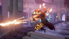
Darin Walsh: The Vypress’ Dash Attack is one of the most powerful magical abilities in her arsenal. Like many of the spells in Mirage, it isn’t a “projectile” per say, but a blend of physical and more “traditional” magic properties.
Her wind-up for the Dash Attack will show the Vypress hanging in mid-air, with a dark, shadowy aura surrounding her. Along with representing her “shadow” iconography, this aura represents her magical Jinn energy - which in Mirage, is actually an intelligent spirit/ghost. It therefore has a shape that mimics her physical form.
During the wind up period, her enemies are free to attack her and interrupt her attack from being performed. She’s very vulnerable for this split second, and a successful interruption attack is especially punishing as it will stagger her and give her the same cooldown penalty as if the spell was cast. Interrupting magic attacks like this is therefore an important combat consideration, so her wind up is supposed to communicate that she is vulnerable - and about to become very deadly if left uninterrupted.
The wind up ends with the Vypress dashing forward, as the traces of her shadowy Jinn spirit fade into the air around her. The path of her twin blades is traced in the air - both because it looks badass and because it communicates to players where exactly her weapon damage is being inflicted during this ability.
Pip: Was there anything which changed drastically from how you thought it would look at the start and how it looks now?
Darin Walsh: Early on in development I had the notion that the Alchemancer would be the class to have more stormy-lightning spell visuals. This didn’t work well with the type of spells the Alchemancer ended up with so I reworked his abilities to be more fiery. I also wasn’t satisfied with just a fire look for his spells so I drove a lot of the visuals to represent birds and bird-like visuals because that felt inline with his flighty play style but devastating attacks. This was an early concept for the Chaos Orb spell with the initial styling.
Pip: Mirage also has its fair share of dismemberment and blood splatters so I'd also be really interested in how you fine tune that - how much is too much? How much is not enough? Do spells inflict different kinds of injury effects?
Brandon Phoenix: As weird as it might sound, our blood and gore system actually has a lot of thought put into it because we believe it's one of the key features of our game, and it serves several vital functions.
Firstly, it's obviously satisfying as the attacker to have a big payoff when you win a fight. Duels in our game are a challenge of skill and careful timing, and it's important to have a satisfying conclusion to each brawl, and giving your actions a direct physical impact is one of the best ways to showcase that.
On the flip side and for the same reasons, as the loser of the fight, the goofy ridiculous ragdolls and over-the-top spray of blood and gore are pretty inherently hilarious and can almost totally take the sting out of a loss. One of the best things we hear when people play our game is laughter as their body goes crashing around the environment.
There are other considerations as well, wanting to tell the story of an encounter through the gore, giving the magic genuine weight and impact, or the aesthetic of blood on the environment, but the experience of winning or losing is really the heart of it.
So, to actually answer your questions, our choices are related to those goals. Too much gore and ridiculous ragdolls and the world and magic stops feeling physical enough to be relatable and weighty, too little and we lose the sense of power of our impacts. Go too far either way and we lose the payoff we're looking for in our encounters. Walking that line is more of an art than a science, and involves plenty of studio arguments.
And yes, spells can inflict horrible physical wounds on characters in a variety of ways including cutting off limbs, crushing heads, exploding torsos, lighting on fire, possession, etc.
Pip: Thanks for your time!
Mirage: Arcane Warfare is currently set for release in the early part of 2017, but there's a closed alpha which interested players can sign up for at the moment which will run in phases, then give way to a beta.


