Total War: Warhammer’s campaign map is unreadable
It fails in fundamental ways
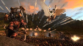
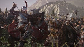
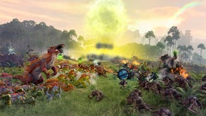
Total War: Warhammer is good at presenting complex information in battles. Your unit of spearmen will tell you when they’re attacked from behind and their banner will flash when they’re about to retreat. Your general glows, and he or she is often comically large compared to regular soldiers. Arrows, cannonballs and spells have brightly coloured trails so you can tell what’s about to hit you.
Outside of battles though, TW: Warhammer has trouble presenting basic information. In particular, the game’s campaign map is a mess which is difficult to parse and frustrating to use. In battles, Creative Assembly make good use of visual shorthand so can you extract relevant information at a glance. The campaign map, meanwhile, is so visually busy that basic information like where your armies are and how far they can move is obscure.
The problem with TW: Warhammer’s map is that it has a stylistic goal which it pursues to the detriment of usability. Specifically, the campaign map is comparatively realistic, so terrain features like mountains shoot up from its surface and forested areas are covered in dozens of tree models. Where most strategy games simplify terrain on their maps for the sake of clarity, TW: Warhammer’s map is crowded with distracting visual noise.
Losing track of your armies is about the most basic thing which could go wrong in a game about setting up battles, and yet in TW: Warhammer it happens irritatingly often. The problem is particularly acute for the Greenskins and Dwarfs, who spend much of the game moving their short counters through narrow and tall mountain passes. If you lose track of your own counter between the peaks you can access the forces list to find them, but the same can’t be said for enemies.
AI factions don’t make great use of the ambush stance, which allows you to take an enemy by surprise, but they hardly need to in mountain areas where the counters are just too short to be clearly seen. Often, you end your turn just short of an army you couldn’t see, and fight a battle you couldn’t reasonably predict. Mercifully, it’s impossible to accidentally send your troops into an offensive battle if you mistakenly click past a hidden army. Instead, however, your army will chart a new path to their objective which avoids the enemy, and if you’re not alert your twenty troops will end up doubling back because there’s one unit of goblins at the end of the pass they haven’t been instructed to fight.
The same is true to a lesser extent in the game’s forests, where dozens of tree models make it difficult to tell at a glance where you stand in relation to enemy settlements and armies. Worse, you can’t actually pass through all of TW: Warhammer’s forests, and the game makes no effort to communicate which are impassable. You can, for instance, go through the forest south of Bretonnia but not the one in the Empire’s capital province (except in the centre where it’s less dense). You can’t go through the forest below Grunberg, except at the very bottom – yes, that looks identical but for some reason it’s different.
There are tooltips which distinguish between light and dense forest if you hover over an area for long enough, but it’s not immediately clear that light means passable, nor is it apparent how far the light forest extends beyond the point you’re hovering over. Also, even if you find a forest you can pass through, TW: Warhammer makes it difficult to move by placing the path selection beneath the trees, so it’s obscured unless you zoom in.
Similarly, it’s possible to determine that you can cross the river directly above the Empire’s capital. If you mouse over the collection of discoloured rocks on the shore, you’re rewarded with a tooltip telling you it’s a land bridge. Given, though, that the campaign map clearly strives to be readable by all players at a glance, these are bizarrely cryptic way of delivering basic information. Worse still, if you’re new to the game the first you hear of the land bridge might be when an enemy army crosses over and besieges your capital.
The realistic terrain also makes it difficult to figure out what, if any, movement penalties are applied to your units. I noticed early on that my Vampire Count armies were moving more slowly in mountain snow than on grassland. That makes instinctive sense, of course, but when the map gradually transitions between snowy mountains and grassy plains, it’s impossible to determine except by experimentation where movement penalties begin and end. Likewise, while most of the Dwarfs and Greenskins territory is situated in mountain passes, the game only inflicts the extra ‘mountain pass’ attrition in some areas, and it isn’t clearly related to the appearance of the pass in question.
The advantage of TW: Warhammer’s map over the extremely simple design of early Total War games is that you can move your armies freely. In other words, if you want to set up an ambush in woods or block a particular road, TW: Warhammer supports you. The busy scenery gets in your way here too, though. Armies in TW: Warhammer have a glowing circle around them called a zone of control. In theory, enemy armies must engage your army if they want to cross this circle. However, since armies can go off road, often they can skirt around your army by passing through an area that looks impassable, such as the foothills of a mountain or right along the shore. It’s frustrating to be tricked not by the cleverness of the AI but the deceptive map.
The best way – often the only way – to get a clear picture of where you are and where you can safely go is to use the strategic overview map. In addition to the standard campaign map, it’s possible to switch to a flat, paper map where terrain features are drawn on and roads are clearly marked. You can even switch between various map modes and see, for instance, the attitude of your neighbours to you. However, you can’t issue orders on this map so you’ll always have to use both views in conjunction. Obviously the game is better for the inclusion of this view, but it’s difficult to fathom why TW: Warhammer has two views with serious limitations and not one clear, responsive view.
It would be wrong to say TW: Warhammer’s map values style over substance. Recent strategy games like Civilization VI have shown it’s possible to have a clear, clean map design which is also beautiful. This isn’t limited to hex grid games either: Paradox’s maps in games like Crusader Kings II and Europa Universalis IV aren’t perfect, but they’re legible and they’ve become much better since the respective launches of both games. It’s difficult to appreciate the aesthetics of something which gets in your way.
TW: Warhammer is not a very complicated game outside of battles. There is no good reason why all the information relevant to your campaign can’t be presented in one view. When you’re fighting another army the game does a good job of relaying relevant information. At a glance, you can tell which fights are going well, which units are going to flee and where you ought to be looking. By contrast in the campaign, it’s often difficult to figure out where your armies are and where they can move. TW: Warhammer’s battle view presents complex information simply. The campaign view presents simple information in a needlessly complex way.


